
Forum
14,955 posts Identified fonts
Posts by marty666

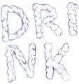
L's and Y's are different...
probably hand-drawn, not a font
probably hand-drawn, not a font
Selvam, please read your message before pressing the 'submit' button...
Looks like a 12yo kid trying to write a text message to his BFFL
As you're on Windows Seven, i guess you have a full keyboard.
So please use all the keys.
Looks like a 12yo kid trying to write a text message to his BFFL
As you're on Windows Seven, i guess you have a full keyboard.
So please use all the keys.
haaa faut le savoir ^^
Pour savoir comment installer une police, merci de lire la FAQ http://www.dafont.com/fr/faq.php
Sous Windows 7/Vista :
Sélectionnez les fichiers de polices (.ttf, .otf ou .fon) puis Clic-droit > Installer
Edited on Jun 27, 2011 at 11:40 by marty666
Sous Windows 7/Vista :
Sélectionnez les fichiers de polices (.ttf, .otf ou .fon) puis Clic-droit > Installer
Edited on Jun 27, 2011 at 11:40 by marty666
no it's not Infinite Justice
Probably not a font
I guess it's a logo made with a Wacom or something like that, but not a font...
The 3 "e"s are different, the 2 "t"s too.
Edited 2 times. Last edit on Jun 24, 2011 at 10:12 by marty666
I guess it's a logo made with a Wacom or something like that, but not a font...
The 3 "e"s are different, the 2 "t"s too.
Edited 2 times. Last edit on Jun 24, 2011 at 10:12 by marty666
the text is very small, but big enough to see it's not Avant Garde Bold
:(
:(
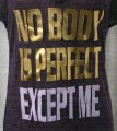

both R are different... probably not a font, just hand-drawn letters.
ha ha tu veux tromper ta femme ? la police ? ton employeur ?


SashiX i think you're talking about the fonts used by default inside webpages, not for the UI.
no problem.
Edited on Jun 23, 2011 at 19:01 by marty666
Edited on Jun 23, 2011 at 19:01 by marty666
i know you're not supposed to be polite or something like that...
no problem, it seems you got that
but please at least try to name your threads in a useful way.
i mean, you're posting 10 requests a minute, all named 'Font'
are you a bot, or something like that ?
Just think about the people who will maybe try to find "tony hawk's pro skater 3"...
no problem, it seems you got that
but please at least try to name your threads in a useful way.
i mean, you're posting 10 requests a minute, all named 'Font'
are you a bot, or something like that ?
Just think about the people who will maybe try to find "tony hawk's pro skater 3"...
Not rude, i just gave you a link for you to read and apply...
Most of the problems we have to face here are caused by a lack of interest from the visitors in this FAQ.
It's an interesting page. Really.
Did you at least read it ?
PS : you forgot to turn off the "caps lock" key on your keyboard
Most of the problems we have to face here are caused by a lack of interest from the visitors in this FAQ.
It's an interesting page. Really.
Did you at least read it ?
PS : you forgot to turn off the "caps lock" key on your keyboard
no problem ! =)

Identified font: Teacher A
Identified font: Titillium Text Bold
All times are CEST. The time is now 20:16
