
Forum
146 posts Identified fonts Requests only
Posts by dakshinamurti

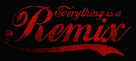


Identified font: Concurso Italian
Can someone help me out, please?


Identified font: Grobold

You, sir, Rock!


that's also my feeling, but when I try the match on illustrator, it seems that the letters are taller than the mage... could it be that they were altered on the design by compressing the height?

seems to be futura, but which style? bold, book, normal?
Not avantgarde gothic due to the Q
Reuploaded because of prior distortion

Reuploaded because of prior distortion
You sir, Rock! Thanks!
All times are CEST. The time is now 23:44
