Forum
3,821 posts Identified fonts
Posts by donshottype
Looks like the custom wordmark for the blood sugar lowering drug with this tradename.
This type of _i_ is found in Trebuchet, The Mix, Yalta Sans, Corpid, Greta Sans, Vialog and various other fonts.
Update: p.s. none of these fonts is a match for the rest of the letters.
Edited 2 times. Last edit on Apr 24, 2017 at 17:42 by donshottype
This type of _i_ is found in Trebuchet, The Mix, Yalta Sans, Corpid, Greta Sans, Vialog and various other fonts.
Update: p.s. none of these fonts is a match for the rest of the letters.
Suggested font: Trebuchet
Edited 2 times. Last edit on Apr 24, 2017 at 17:42 by donshottype
Identified font: Fette Fraktur
Unless Paramore is using a font made especially for its use, it is unlikely that there is a matching font with this isomorphic 3d treatment.
Here is explantion of how the effect was probably created.
Start with some narrow letters.
Slope them leftwards.
Rotate the letters rightwards until the vertical strokes are again vertical.
Like so -- ignore the typo of _N_ for _R_; its not worth redoing the image:

I did not find a font that is an exact match to the original upright letters.
Perhaps somebody has a suggestion?
Similar fonts include:
Block Gothic RR Medium Extra Condensed
Craft Gothic Condensed
Caracoltv
but none has the _M_ with a vertex that does not drop to the baseline.
Edited 4 times. Last edit on Apr 22, 2017 at 16:30 by donshottype
Here is explantion of how the effect was probably created.
Start with some narrow letters.
Slope them leftwards.
Rotate the letters rightwards until the vertical strokes are again vertical.
Like so -- ignore the typo of _N_ for _R_; its not worth redoing the image:

I did not find a font that is an exact match to the original upright letters.
Perhaps somebody has a suggestion?
Similar fonts include:
Block Gothic RR Medium Extra Condensed
Craft Gothic Condensed
Caracoltv
but none has the _M_ with a vertex that does not drop to the baseline.
Edited 4 times. Last edit on Apr 22, 2017 at 16:30 by donshottype
For the initial swash _h_
http://www.myfonts.com/fonts/cbx-jukebox/bookman-jf-pro/italic/glyphs.html#glyphs/702048/323
http://www.myfonts.com/fonts/cbx-jukebox/bookman-jf-pro/italic/glyphs.html#glyphs/702048/323
Identified font: Bookman Italic
Clarendon. Vintage TV suggests pre-digital, but this is deceptive as the choice of a recent digital Bookman for _hooptie_ [see next post] implies that this is more recent artwork.
Link is to Bitstream digital version because MyFonts automatically places the _fi_ ligature for the Linotype, Adobe and URW versions. Without the ligature they are also a match.
Edited 2 times. Last edit on Apr 21, 2017 at 16:16 by donshottype
Link is to Bitstream digital version because MyFonts automatically places the _fi_ ligature for the Linotype, Adobe and URW versions. Without the ligature they are also a match.
Identified font: Clarendon
Edited 2 times. Last edit on Apr 21, 2017 at 16:16 by donshottype
AFAIK these distressed letters are not a font as such.
They are derived from alternate letters in Weiß-Gotisch, produced by Emil Rudolf Weiß for Bauersche Gießerei in 1936. There is a digital revival by CybaPee
They are derived from alternate letters in Weiß-Gotisch, produced by Emil Rudolf Weiß for Bauersche Gießerei in 1936. There is a digital revival by CybaPee
Suggested font: Weiß-Gotisch
The narrow, heavy, boxy sans letters of _GASMONKEY_ may have been derived directly or indirectly from lettering samples in a 1941 Speedball® Lettering Pen instructional booklet.
This was the inspiration for Handmade Gothic JNL.
Some letters are quite similar: particularly _G_, _A_, _K_ and _E_ [when turned upside down].
This was the inspiration for Handmade Gothic JNL.
Some letters are quite similar: particularly _G_, _A_, _K_ and _E_ [when turned upside down].
Suggested font: Handmade Gothic
Horizontally compressed and run together. Connecting tail added to _o_
Edited on Apr 19, 2017 at 08:58 by donshottype
Identified font: Candice
Edited on Apr 19, 2017 at 08:58 by donshottype
The original is Matthew Carter's Cascade Script
Bitstream calls its version Freehand 471 [already suggested]
Edited on Apr 18, 2017 at 21:40 by donshottype
Bitstream calls its version Freehand 471 [already suggested]
Identified font: Cascade Script
Edited on Apr 18, 2017 at 21:40 by donshottype
Update:
I see that this was identified 2 minutes before I posted.
With custom splatter texture applied
Edited on Apr 18, 2017 at 08:33 by donshottype
I see that this was identified 2 minutes before I posted.
With custom splatter texture applied
Edited on Apr 18, 2017 at 08:33 by donshottype
Perhaps a proprietary sports font?
Secca Art Bold is perhaps the closest font available for use by the public.
Secca Art Bold is perhaps the closest font available for use by the public.
Suggested font: Secca Art Bold
Recently asked here:
http://www.dafont.com/forum/read/313971/fonts
http://www.dafont.com/forum/read/313971/fonts
Perhaps custom for the Château?
Some similarity to Castle Bold. which is NOT THE FONT. Imagine Castle Bold made slightly wider, with flare serifs [similar to Optima and others] and some minor edits such as the stem/serif added to a thickened rhs stroke of _U_.
p.s. The French word _Château_ has the same meaning as the English word _Castle_. Coincidence, or a deliberate choce of a base font by the custom font-maker?
Edited 2 times. Last edit on Apr 16, 2017 at 21:27 by donshottype
Some similarity to Castle Bold. which is NOT THE FONT. Imagine Castle Bold made slightly wider, with flare serifs [similar to Optima and others] and some minor edits such as the stem/serif added to a thickened rhs stroke of _U_.
p.s. The French word _Château_ has the same meaning as the English word _Castle_. Coincidence, or a deliberate choce of a base font by the custom font-maker?

Suggested font: Castle Bold
Edited 2 times. Last edit on Apr 16, 2017 at 21:27 by donshottype
Identified font: Intelo
Detroit 11 Bevel One has a similar, but not identical, faceted/prismatic treatment of the letters, but is too thick and wide.
Suggested font: Detroit 11 Bevel One
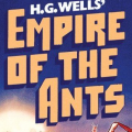
ITC Pioneer No. 2 designed by Tom Carnase for ITC in 1970.
The book title uses the phototype era original and slopes the font slightly, does some minor horizontal compression, vertical stretching of _E_ and _A_, and drops the rhs leg of _M_, _R_ and _A_ below the baseline.
The digital version is the same as the phototype era original.
Edited on Apr 15, 2017 at 10:43 by donshottype
The book title uses the phototype era original and slopes the font slightly, does some minor horizontal compression, vertical stretching of _E_ and _A_, and drops the rhs leg of _M_, _R_ and _A_ below the baseline.
The digital version is the same as the phototype era original.
Identified font: ITC Pioneer
Edited on Apr 15, 2017 at 10:43 by donshottype
The older version, Helvetica Bold, also fits
http://myfonts.us/td-IqMPev
Edited on Apr 14, 2017 at 14:07 by donshottype
http://myfonts.us/td-IqMPev
Identified font: Helvetica Neue Bold
Edited on Apr 14, 2017 at 14:07 by donshottype
Additional slope applied
Also sold under the name English 111 by Bitstream
Also sold under the name English 111 by Bitstream
Identified font: Shelley Script
Compare to Ambroise Firmin Demi with width compressed to 36%

This is closer, but still lacks the tone of the letters in_SHOOTERS_

This is closer, but still lacks the tone of the letters in_SHOOTERS_
All times are CEST. The time is now 12:04


