
Forum
3,821 posts Identified fonts
Posts by donshottype

More information on Rock Serif
http://www.underconsideration.com/brandnew/archives/the_nbc_peacock_is_gone_and_rightfully_so.php
Edited on May 01, 2017 at 10:02 by Lemmiwinks
http://www.underconsideration.com/brandnew/archives/the_nbc_peacock_is_gone_and_rightfully_so.php
Edited on May 01, 2017 at 10:02 by Lemmiwinks

For similar letterforms -- squarish curved corners and square corners for the top rhs and bottom lhs of _S_, see LTC Squareface.
Compare the image to LTC Squareface with width squeezed to 40%:

If some serifs were clipped, the thickness of the horizontal strokes was reduced and the mid-stroke on _S_ was made horizontal the squeezed LTC Squareface would be close to the letters in the image.
Edited on Apr 29, 2017 at 17:25 by donshottype
Compare the image to LTC Squareface with width squeezed to 40%:
If some serifs were clipped, the thickness of the horizontal strokes was reduced and the mid-stroke on _S_ was made horizontal the squeezed LTC Squareface would be close to the letters in the image.
Suggested font: Squareface
Edited on Apr 29, 2017 at 17:25 by donshottype

Custom.
The _P_ looks like a pumped up Philly Sport so that it half way to the weight of Candice.
The _earl_ can be loosely approximated by Scriptorama Tradeshow
The _P_ looks like a pumped up Philly Sport so that it half way to the weight of Candice.
The _earl_ can be loosely approximated by Scriptorama Tradeshow
Suggested font: Scriptorama Tradeshow

For a substitute for non-Apple computers, try Chiq Bold
Edited on Apr 26, 2017 at 19:38 by donshottype
Suggested font: Chiq
Edited on Apr 26, 2017 at 19:38 by donshottype

For the swash _E_
https://www.myfonts.com/fonts/marksimonson/bookmania/bold-italic/glyphs.html#glyphs/655574/526
For the swash _V_
https://www.myfonts.com/fonts/marksimonson/bookmania/bold-italic/glyphs.html#glyphs/655574/1181
https://www.myfonts.com/fonts/marksimonson/bookmania/bold-italic/glyphs.html#glyphs/655574/526
For the swash _V_
https://www.myfonts.com/fonts/marksimonson/bookmania/bold-italic/glyphs.html#glyphs/655574/1181
Identified font: Bookmania Bold Italic

Suggested font: 1456 Gutenberg B42
Suggested font: Gutenberg C
A cleaned up version of the B42 character set used used by Johann Gutenberg in his Latin Bibles (42 and 36 lines) of the mid 15th century.
No exact match to your image in digital fonts, but several "Gutenberg" fonts are close.
Gutenberg B
Edited on Apr 26, 2017 at 11:43 by donshottype
No exact match to your image in digital fonts, but several "Gutenberg" fonts are close.
Gutenberg B
Suggested font: Gutenberg B
Edited on Apr 26, 2017 at 11:43 by donshottype

Identified font: Charter Oak
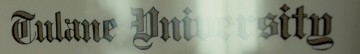
Fette Gotisch is the inspiration for almost all of the letters, i.e. _T_, _u_, _l_, _n_, _e_, lhs of _U_, _i_, _r_, _s_, and _t_. For rhs of _U_ see rhs of _P_.
Edited on Apr 25, 2017 at 14:48 by donshottype
Suggested font: Fette Gotisch
Edited on Apr 25, 2017 at 14:48 by donshottype
Similar features in Morris Fuller Benton's Wedding Text of 1901. Various digital versions including HiH's Wedding. See also Engravers Old English and Old English.
Edited 2 times. Last edit on Apr 30, 2017 at 13:03 by donshottype
Suggested font: Wedding
Edited 2 times. Last edit on Apr 30, 2017 at 13:03 by donshottype

Custom wordmark apparently derived from Optima Medium with minor edits and pasted semi-serifs, in the Rotis Semi Serif style.
Edited on Apr 25, 2017 at 14:23 by donshottype
Suggested font: Optima
Edited on Apr 25, 2017 at 14:23 by donshottype
Just some letters I made as an exercise some time ago. Not offered as a font.


Identified font: Haettenschweiler

Identified font: Caslon 540
All times are CEST. The time is now 07:45
