
Forum
3,821 posts Identified fonts
Posts by donshottype


Using alts for _T_, _m_ and _y_
https://www.myfonts.com/fonts/laura-worthington/samantha-upright-script/upright/glyphs.html#glyphs/650589/833
https://www.myfonts.com/fonts/laura-worthington/samantha-upright-script/upright/glyphs.html#glyphs/650589/1745
https://www.myfonts.com/fonts/laura-worthington/samantha-upright-script/upright/glyphs.html#glyphs/650589/2393
alt _y_ has rhs of tail clipped.
p.s. edited to change the link to the alt _m_
Edited 2 times. Last edit on May 03, 2017 at 09:07 by donshottype
https://www.myfonts.com/fonts/laura-worthington/samantha-upright-script/upright/glyphs.html#glyphs/650589/833
https://www.myfonts.com/fonts/laura-worthington/samantha-upright-script/upright/glyphs.html#glyphs/650589/1745
https://www.myfonts.com/fonts/laura-worthington/samantha-upright-script/upright/glyphs.html#glyphs/650589/2393
alt _y_ has rhs of tail clipped.
p.s. edited to change the link to the alt _m_
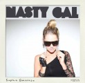
Identified font: Samantha Upright
Edited 2 times. Last edit on May 03, 2017 at 09:07 by donshottype

Also as a pay version under the name Good Vibrations
http://myfonts.us/td-gLQH3a
Edited on May 03, 2017 at 00:28 by donshottype
http://myfonts.us/td-gLQH3a
Identified font: Great Vibes
Edited on May 03, 2017 at 00:28 by donshottype
PacMan style letters.
No exact match found. Custom lettering?
Delarge is a fair match for _N_, _S_ AND _Y_
No exact match found. Custom lettering?
Delarge is a fair match for _N_, _S_ AND _Y_
Suggested font: DeLarge
Many minor differences in stroke endings suggest that this is handlettered with a calligraphic broad nib pen.
Asked numerous times in various font ID forums with no concenses on a matching font.
IMHO two fonts are perhaps the closest.
The first is Ambroise Francois Regular
IMHO two fonts are perhaps the closest.
The first is Ambroise Francois Regular
Suggested font: Ambroise Francois

Seems to be a TV cartoon mock logo in the style of Showcard Gothic, Comedy and Dreamland -- which use angled heavy vertical strokes that taper from top to bottom
Edited on May 01, 2017 at 09:16 by donshottype
Suggested font: Showcard Gothic
Edited on May 01, 2017 at 09:16 by donshottype

Gucci is highly unlikely to use a font available to the public for its logo.
The cursive letters are custom or perhaps made into a private font.
Some similarity to Gracia Series 40.
Other fonts that are somewhat similar include Copperplate Script, Kunstler Script, Palace Script and Shelley Script. Also, for the _ucci_ only, Edwardian Script.
Edited on May 01, 2017 at 09:21 by donshottype
The cursive letters are custom or perhaps made into a private font.
Some similarity to Gracia Series 40.
Other fonts that are somewhat similar include Copperplate Script, Kunstler Script, Palace Script and Shelley Script. Also, for the _ucci_ only, Edwardian Script.
Suggested font: Gracia Series 40
Edited on May 01, 2017 at 09:21 by donshottype

Identified font: Gill Sans Nova Cond
Edited on May 01, 2017 at 08:18 by donshottype

If you want a messy similar font --- which is apparently made from an Olivetti typescript -- you could use Olivetti Type 2
Edited on May 01, 2017 at 07:59 by donshottype
Suggested font: Olivetti Type 2
Edited on May 01, 2017 at 07:59 by donshottype
Looks like a typed sample on the Ollivetti Lettera 22 typewriter.
Leaving aside the messy result, the letters and % sign look close to the character set shown in the small pale yellow box at bottom lhs of the Ollivetti Lettera 22 advertisment used on the web-page for the A-2 Typewriter font.
The numbers in your typewritten sample are produced by an Ollivetti Lettera 22 with a serifed set of numbers. [The red numbers were made by using a red and black dual color ribbon that was shifted manually to create the red color].
The digital typewriter font offered by A-2 is derived from a set of Ollivetti Lettera 22 type faces, but is not identical to your sample. The typewriter produced a monospace result. The digital Typewriter from A-2 is proportional spaced.
Suggested font: Typewriter
Dampfplatz is indeed the matching variation of Fette Gotish 


Lettering by designer Bogdan Ceausescu or illustrator Sebastian Pren for Pren's zine On/Off the grid, Choriso Press, in 2016.
http://delicate-vacuum.com/post/159968781137/b-ceausescu-onoff-the-grid-a-collaboration-with
The lettering style is called "reverse contrast" and is usually done for serifed letters, like the wild west Wanted posters.
IMHO it is unlikely that either of these persons made a font from the art project.

RAPTORS
City Bold squeezed to about 55%

Bitstream sells a less expensive version as Square Slabserif Bold 711
http://myfonts.us/td-Udr5re
City Bold squeezed to about 55%
Bitstream sells a less expensive version as Square Slabserif Bold 711
http://myfonts.us/td-Udr5re
Identified font: City Bold

Identified font: Superclarendon Bold
The UL website provides downloads of the UL logos in eps form.
http://www.ul.com/marks/ul-listing-and-classification-marks/downloadable-ul-marks/
Here is a rendering of the eps letters with enough detail to compare to possible substitutes:

Edited on Apr 29, 2017 at 15:29 by donshottype
http://www.ul.com/marks/ul-listing-and-classification-marks/downloadable-ul-marks/
Here is a rendering of the eps letters with enough detail to compare to possible substitutes:
Edited on Apr 29, 2017 at 15:29 by donshottype

Custom for UL?
Several fonts could be used to approximate it, including Korolev Condensed Heavy
Several fonts could be used to approximate it, including Korolev Condensed Heavy
Suggested font: Korolev Condensed Heavy


Clearer image of the letters -- extracted from another poster for GMV:

AFAIK there is no font that is an exact match.
GOOD MORNING VIETNAM is lettered in the general style of a Clarendon-style Egyptian, such as Egyptienne Bold Condensed
The width, horizontal contrast and serif length are similar Egyptienne Bold Condensed but the the horizontal strokes are too heavy and the serif thickness is about twice that in GOOD MORNING VIETNAM.
Other differences include the "drainpipe" curved lower rhs on _G_, the unusual leg on _R_, the top lhs serif on _A_, and the bottom rhs serif on _N_ and _V_.
Suggested font: Egyptienne Bold Condensed
All times are CEST. The time is now 19:41
