
Forum
13,711 posts Identified fonts
Posts by koeiekat

Identified font: FG Rakel
I asked to see whether I could find a better pict. A URL would have been handy.
 !!
!!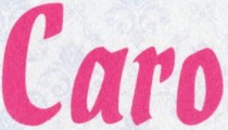
Identified font: Holla Script
Have you noticed that every single letter is different?
At this size the e seems to be different. Got something better?
Where does this come from?

Identified font: Pea Bev
Dunno Claude, but the fact that it doesn't appear on the print (thanks for the link) imho doesn't by definition mean that it was not part of the character set. Anyway, it is there now 
Edited on Aug 28, 2011 at 16:05 by koeiekat

Edited on Aug 28, 2011 at 16:05 by koeiekat
claudeserieux said 
koeiekat said
Claude, do you know if there is a Giraldon (under whatever name) around with these ligatures?
Only metal typeface
http://www.opto.fr/portfolio/specimen-cerisaie
Not anymore


Don't bump that fast. It is Sunday morning, remember?

Suggested font: Black Jack (Already suggested here)
Bump!!
Claude, do you know if there is a Giraldon (under whatever name) around with these ligatures?

One of the very few handwriting fonts WSI did not copy from the TMaker collection.
Edited on Aug 27, 2011 at 14:02 by koeiekat
Identified font: HandScript
Edited on Aug 27, 2011 at 14:02 by koeiekat
... a font ... one more of those things that are carefully hiding what it is talking about. It will not understand this comment though as it is one of those minds that are stones of great smoothness which are demonstrably capable of infinite rolling without once gathering a lick of moss.
1947!! 
 Overlooked the X.

 Overlooked the X.
1957 and you expect a match? Fortunately for you Harold Lohner made something based on the same type, Christmas Card.
Identified font: Christmas Card
All times are CEST. The time is now 15:00
