
Forum
13,581 posts Identified fonts Requests only
Posts by Heron2001

The Norse were here before Columbus... but the historians gave Columbus the credit - because he and his mates mingled with the natives... 

It's kind of sad. We have Black History Month - now called Afro-American History Month - and that gets a big play on television and throughout the media. No one seems to know about the Hispanic History Month. Today I have been invited to be with about 150 Spanish children. Their parents are bringing homemade Spanish dishes for all of us to try. We will be entertained with traditional Spanish songs and dances. I'm looking forward to it.
I asked a friend in New Mexico if she knew, and she hadn't a clue. I asked my friend here in Georgia, and as I did a commercial came on for it - and actor C. Cruz speaking up on folks learning about the Spanish heritage.
And yes, no connection - they just happen to be in the same month.
I asked a friend in New Mexico if she knew, and she hadn't a clue. I asked my friend here in Georgia, and as I did a commercial came on for it - and actor C. Cruz speaking up on folks learning about the Spanish heritage.
And yes, no connection - they just happen to be in the same month.
It's so close to Churchward Design - makes me wonder if they have alternate glyphs available.
http://myfonts.us/td-DFwhFv
http://myfonts.us/td-DFwhFv
Fred - there is a little bistro in Paris that makes a wonderful grilled seabass - you missed out over Christmas.... and October is breast awareness month in the USA too (it's also Hispanic History month)

The A in both mentioned does not come to point. So it might be someone heavies up the last weight with Mr. pointy A
It looks like a graffiti font - http://www.graffitifonts.com/fonts.shtml
or here: http://www.dafont.com/theme.php?cat=606&text=MODIFIER&fpp=50
My eyes are kind of tired right now...
Edited on Oct 12, 2012 at 00:17 by Heron2001
or here: http://www.dafont.com/theme.php?cat=606&text=MODIFIER&fpp=50
My eyes are kind of tired right now...
Edited on Oct 12, 2012 at 00:17 by Heron2001
Does the OP realize he is messing with the mods?
So no one on myfonts came to the rescue... lol
I tried all yesterday and came up blank - it reminded me of Coca-Cola... lol sorry.
Sorry Fred - that link in the good old USA reads:
This video contains content from BMG_Rights_Management, UMPG Publishing, Warner Chappell and EMI, one or more of whom have blocked it in your country on copyright grounds.
Sorry about that.
LOL
This video contains content from BMG_Rights_Management, UMPG Publishing, Warner Chappell and EMI, one or more of whom have blocked it in your country on copyright grounds.
Sorry about that.
LOL
I only know the three line one: http://www.myfonts.com/fonts/ywft/trisect/ and the letterformations are the same - as oppose to Gala Triline... which has different ones.
If I come across anything, I'll be back....
If I come across anything, I'll be back....
The letters all seem to match - with hand modifications done to the G and A...


Not exact but close
Bonn Caps Medium
http://www.fontslog.com/bonnmediumcaps-otf-21332.htm
Bonn Caps Medium
http://www.fontslog.com/bonnmediumcaps-otf-21332.htm
Suggested font: Bonn Caps

nice one wnf - and we also know it this way....
I just noticed the K from the Bodoni you selected doesn't quite match up - it is Poster Bodoni Italic.... ooops
Edited on Oct 11, 2012 at 20:53 by Heron2001
I just noticed the K from the Bodoni you selected doesn't quite match up - it is Poster Bodoni Italic.... ooops
Identified font: Poster Bodoni Italic
Edited on Oct 11, 2012 at 20:53 by Heron2001
Good one fonatica -
It looks like the A is truly an inverted V
the O is upside down -
looks like if it wasn't a font - it was somehow base on Bifur - and I was wracking my brains trying to think of what it could have been...
It looks like the A is truly an inverted V
the O is upside down -
looks like if it wasn't a font - it was somehow base on Bifur - and I was wracking my brains trying to think of what it could have been...
I don't think it is a font - but handlettered for the soul purpose of a new logo.
http://news.yahoo.com/wendys-pigtails-first-touchup-since-1983-040522331--finance.html
The new brand logo was designed by Tesser, an award-winning design firm based in San Francisco.
Edited on Oct 11, 2012 at 19:42 by Heron2001
http://news.yahoo.com/wendys-pigtails-first-touchup-since-1983-040522331--finance.html
The new brand logo was designed by Tesser, an award-winning design firm based in San Francisco.
Edited on Oct 11, 2012 at 19:42 by Heron2001
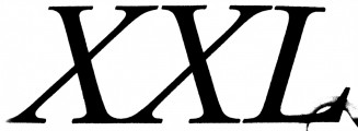
Identified font: Times Roman Bold Italic
All times are CEST. The time is now 15:57
