
Forum
13,581 posts Identified fonts Requests only
Posts by Heron2001


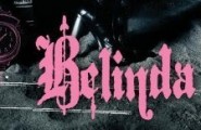
It looks like a heavy form of the commercial font EMPIRE - but closer then Movie Letters is Movie Poster Condensed
http://www.dafont.com/search.php?text=PINK&q=movie+poster
but closer is Universal Accreditation
No matter which you select - the P needs modification - and the I needs to be upside down.... Enjoy.
Edited on Oct 13, 2012 at 23:46 by Heron2001
http://www.dafont.com/search.php?text=PINK&q=movie+poster
but closer is Universal Accreditation
No matter which you select - the P needs modification - and the I needs to be upside down.... Enjoy.
Suggested font: Universal Accreditation
Edited on Oct 13, 2012 at 23:46 by Heron2001
You are welcome.
Six years ago - on this logo for Yves Saint Laurent I wrote:
Submitted on Jun 14, 2006
I would think that Yves Saint Laurent hired a type designer way back when and paid them royally for an exclusive. Meanwhile, ever time I see these initials I keep seeing them as Baker Signet. Perhaps you can modify the Y in Baker and get your style going...
Submitted on Jun 14, 2006
I would think that Yves Saint Laurent hired a type designer way back when and paid them royally for an exclusive. Meanwhile, ever time I see these initials I keep seeing them as Baker Signet. Perhaps you can modify the Y in Baker and get your style going...

You are most welcome.


Please stop double posting - if you have a thread started, then bump it 24 or more hours later... please no reposting.

Identified font: Fllyerfonts - Malfunction

Not 100% sure - but I think you might have some sort of Latienne there... not URW's... but someone's.
Suggested font: Latienne Bold
Identified font: ITC Avant Garde Demibold
You are welcome
In the States they did a news segment on the purple teletubby. Lol. Yep!
I'm not even sure if this was a font or not...
But if you would like something with the same feel - and it's NOT the font... but same feeling - you might want to check out Retriga
http://www.dafont.com/retriga.font?text=Texas+Chainsaw+Massacre
But if you would like something with the same feel - and it's NOT the font... but same feeling - you might want to check out Retriga
http://www.dafont.com/retriga.font?text=Texas+Chainsaw+Massacre
Later - I'm going to end up big and fat if I don't get my daily dose of exercise in... have a great Saturday... and you are welcome.
You are welcome.
The closest I spotted and it wasn't close at all was:
http://www.dafont.com/cm-squish.font?text=TOMO
http://www.dafont.com/cm-squish.font?text=TOMO
A new account? I believe TOMO is handlettered - just because of those two very different Os... so are you looking for HIBACHI... lol
All times are CEST. The time is now 21:53
