
Forum
13,711 posts Identified fonts
Posts by koeiekat


Identified font: Egyptienne Cond Bold
Edited on Oct 07, 2011 at 17:03 by SashiX
And after you have found that you might want to try a Helvetica Condensed or a lookalike.

Identified font: Helvetica Ultra Compressed

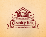
Identified font: Shàngó
Too many clouds, far too less contrast.
Not a font. All letters are different.
Agree.
... and U and C. But they have certainly used the Friz Quadrata to make this logotype.
Janda Curlygirl modified.
The other one is too small.
Edited on Oct 07, 2011 at 18:50 by Rodolphe
The other one is too small.
Identified font: Janda Curlygirl
Edited on Oct 07, 2011 at 18:50 by Rodolphe

Identified font: Off The Drugs

Identified font: Pea Nancy
yep
Edited on Oct 06, 2011 at 21:11 by koeiekat
Edited on Oct 06, 2011 at 21:11 by koeiekat
Close but no match, see the s. The real thing is the old Petrasscript that is not on sale anymore.
Edited on Oct 06, 2011 at 21:10 by koeiekat
Edited on Oct 06, 2011 at 21:10 by koeiekat

@Tjitske
In deze post is zo heen en weer geëdited dat ik er een beetje de pest over in krijg en met als resultaat volslagen foute info. Dus hieronder de werkelijkheid, maar weer eens door mij bijgewerkt. Omdat ik weet dat je graag hetzelfde lettertje gebruikt als het originele kaartje, stel je voor dat je die 9 wilt gebruiken, zal ik wat op de post doen. Even zoeken waar je woont
The perfect match is the Kidstuff (SWFTE International, Ltd.), which Eaglefonts (still) marks as commercial although it is not for sale anymore as SWFTE International, Ltd. has been liquidated ages ago (and rightfully so). You could use the Tabatha, but that one is not the perfect match though, look at the 9 ...
Edited 3 times. Last edit on Oct 06, 2011 at 23:21 by koeiekat
In deze post is zo heen en weer geëdited dat ik er een beetje de pest over in krijg en met als resultaat volslagen foute info. Dus hieronder de werkelijkheid, maar weer eens door mij bijgewerkt. Omdat ik weet dat je graag hetzelfde lettertje gebruikt als het originele kaartje, stel je voor dat je die 9 wilt gebruiken, zal ik wat op de post doen. Even zoeken waar je woont

The perfect match is the Kidstuff (SWFTE International, Ltd.), which Eaglefonts (still) marks as commercial although it is not for sale anymore as SWFTE International, Ltd. has been liquidated ages ago (and rightfully so). You could use the Tabatha, but that one is not the perfect match though, look at the 9 ...
Identified font: Kidstuff
Edited 3 times. Last edit on Oct 06, 2011 at 23:21 by koeiekat

Identified font: Caslon

Identified font: Fantastic Font

Simply is the BatangChe, a Windows system font (Korean).
You don't want a font, you want a dingbat 

Old Uncial discussion. In spite of the 'H' Durrow is the closest.
All times are CEST. The time is now 14:08
