
Forum
13,711 posts Identified fonts
Posts by koeiekat

@Daaams, "this is most probably not a font" is perfectly correct. It is just short for "This is probably, if not most, not a font", with in itself is an understatement for, and a nice way, to say "this is not a font" keeping open the minuscule possibility that it might be a font after all.
Now, interpreting this does indeed ask for some active brain power, which TheBrain most probably lacks. Most probably because there is of course the minuscule possibility that TheBarain does posses this power but failed activating it.
@TheBrain, it is the red button with the white circle and little vertical bar on your remote control.
Now, interpreting this does indeed ask for some active brain power, which TheBrain most probably
 lacks. Most probably because there is of course the minuscule possibility that TheBarain does posses this power but failed activating it.
@TheBrain, it is the red button with the white circle and little vertical bar on your remote control.

This probably, if not most, an irrelevant remark ... but then, with a brain like that ...
Might have picked another pict with that name ...
Might have picked another pict with that name ...

Now imagine this 1 is not a 1 bit an l. Food for thought?
ASAP!!

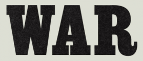
Identified font: Champion Gothic Bantamweight
Edited on Oct 12, 2011 at 17:49 by SashiX
 I need to know!! Which one is the Times New Roman/
Hééééééééééééééélp!!
What are you - successfully - selling on Myfonts?
You can download it. Be it at a price 

What made you so sure? The C?

OK kids, tell me, which one is the Arial and which one is the Times New Roman?


For Gary Cahill. Manually condensed/backslanted.
Edited 2 times. Last edit on Oct 10, 2011 at 00:59 by rocamaco
Identified font: Zennor
Edited 2 times. Last edit on Oct 10, 2011 at 00:59 by rocamaco
Probably the Hoboken-ExtraBold (Brendel&Papst) or the Old Century (Bay Animation). Both based on the Hollandse Mediaeval by Sjoerd Hendrik de Roos. Canada Type has a version named Dutch Mediaeval (Dutch for Hollandse)but not an extra bold and that one came out far after Jimmy Hendriks.
Both manually condensed it seems. Never seen a original condensed version as digital type.
Both manually condensed it seems. Never seen a original condensed version as digital type.

Suggested font: Handel Gothic Medium

Three different 'E's. Hand scribbled.
Suggested font: Egyptienne Cond Bold
The Marcelle is the Script MT after a termite attack 

All times are CEST. The time is now 14:18
