
Forum
13,581 posts Identified fonts Requests only
Posts by Heron2001


the letters are Goudy Heavy (manually condensed) - I do not know of the font being an outline one... but anything goes these days with fonts.
Edited on Mar 05, 2013 at 19:32 by Rodolphe
Identified font: Goudy Heavyface
Edited on Mar 05, 2013 at 19:32 by Rodolphe
If you are familiar with the original URW fonts - and have the CD - every font they offered, they gave supplements -- including each font had an outline around it... Just an old thought.
It is not a font - it was handlettered by Paul Barnes
http://moderntypography.com/Logos/Givenchy/index.html
http://moderntypography.com/Logos/Givenchy/index.html
I am not sure this is a font - because the two esses are not the same.
Double Feature may be the way to go.... or fix up Creepy from Monotype....
Double Feature may be the way to go.... or fix up Creepy from Monotype....
So close to ITC Eras Book - standing upright for a change...
http://myfonts.us/td-zn2NfO
http://myfonts.us/td-zn2NfO
I hope someone finds this for you - if they don't and you'd like something close (not the same mind you) take a look at Google Fonts Princess Sofia.
I didn't see the Extended when looking - but I've changed it for the name. Have a great day!
It reminds me of an old Berthold font - but I wonder if this really is a font -- not one of the "e" are the same... I know there are fonts that have multiple versions of the same letter - but I don't know if this is one of them - I think this sample is from a sign painter....
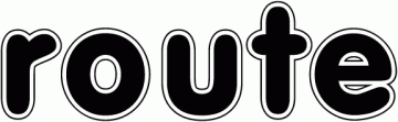
The letters are close to Vag Rounded - but I know somewhere there is a rounded font with an outline around it...
Edited on Mar 05, 2013 at 17:20 by drf_
Identified font: VAG Rounded
Edited on Mar 05, 2013 at 17:20 by drf_
Hopefully someeone will come along and know this font - but if you want something close - same feeling - but it is not the font
look at Flamenco http://myfonts.us/td-blY4od
again - it is NOT the font.
look at Flamenco http://myfonts.us/td-blY4od
again - it is NOT the font.

Found it.
Edited on Mar 05, 2013 at 16:18 by Heron2001
Identified font: United Sans Semi Extended Stencil
Edited on Mar 05, 2013 at 16:18 by Heron2001
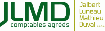
The JLMD is very close to http://www.dafont.com/material-sans.font?text=JLMD+comptables+agrees
Not exact - but close: http://www.dafont.com/targa.font?text=HALECAT+NURSERY
Edited on Feb 26, 2013 at 16:01 by drf_
Edited on Feb 26, 2013 at 16:01 by drf_
If you are looking for something that has the same "feel" (BUT NOT THE SAME)
Try:
Pablo: http://myfonts.us/td-iIWkzm
or take a look at P22's collection of artist's signatures... it might help you get even closer to that "look."
Try:
Pablo: http://myfonts.us/td-iIWkzm
or take a look at P22's collection of artist's signatures... it might help you get even closer to that "look."
concepts - is so familiar. First it reminded me of House Industries Chalet collection - but the N doesn't... that reminds me of You Work For It's Pakt
http://www.youworkforthem.com/font/T0016/ywft-pakt
Neither perfect - but they are close...
http://www.youworkforthem.com/font/T0016/ywft-pakt
Neither perfect - but they are close...

Identified font: Monoton
Thank you for getting back - you've made my day. Good luck on your project.
You are most welcome.
All times are CEST. The time is now 08:48
