
Forum
313 posts Identified fonts Requests only
Posts by Mr. Dude

Looks like Bold, but stretched out.

Identified font: Eras Bold

Hate to revive a dead thread but I think I found a very similar font - although it did come way after the game's release.
Suggested font: Hawkeye
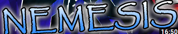
Identified font: Kimberley

Suggested font: Inter Semi-bold

Identified font: VCR OSD Mono
WAIT I JUST LOOKED AT THE B - not the same font. But similar!

Looks more like this, tightly kerned and with an outline.
Suggested font: Neue Helvetica Pro 83 Extended Heavy

Identified font: Impact
Also, there's a Wikipedia article that goes over their typography. It might be Veranda like I said above, or one of the other fonts listed here.
https://en.wikipedia.org/wiki/Wikipedia:Typography#Core_fonts_for_the_Web
https://en.wikipedia.org/wiki/Wikipedia:Typography#Core_fonts_for_the_Web

Suggested font: Verdana
Identified font: Papyrus

Suggested font: Roboto

Identified font: DIN Bold

Identified font: Uni Sans Heavy

Identified font: VCR OSD Mono


Suggested font: Akzidenz-Grotesk

Identified font: Blender Bold

That "t" definitely reminds me of a heavier weight of Coolvetica. It might even be inspired by the logo:
"Coolvetica is a scratch built, sans serif font, based on an American chain store logos circa 1970"
But the "&" is definitely not the same.
PAID HEAVIER WEIGHT - https://www.fontspring.com/fonts/typodermic/coolvetica/coolvetica-heavy
"Coolvetica is a scratch built, sans serif font, based on an American chain store logos circa 1970"
But the "&" is definitely not the same.
PAID HEAVIER WEIGHT - https://www.fontspring.com/fonts/typodermic/coolvetica/coolvetica-heavy
Suggested font: Coolvetica
All times are CEST. The time is now 03:12
