
Forum
13,582 posts Identified fonts Requests only
Posts by Heron2001


It looks like Arial Rounded Bold that someone put a couple of lines through to make it look like it's a stencil.
Edited on Apr 14, 2013 at 11:59 by drf_
Suggested font: Arial Rounded Bold
Edited on Apr 14, 2013 at 11:59 by drf_
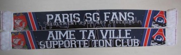
It looks like someone erased the outline around Varsity
Edited on Apr 13, 2013 at 19:10 by drf_
Suggested font: Varsity
Edited on Apr 13, 2013 at 19:10 by drf_
This looks put together by hand... and they might have used something like ITC Lubalin to achieve this look
http://myfonts.us/td-PUINQK
http://myfonts.us/td-PUINQK
It's that darn R...
I thought perhaps Bodoni at first - but that R
Then I thought, oh maybe Bauer Bodoni - and again NO C is all wrong
So I figured Modern 216 - same headache...
It is a font - and there is an exact out there... but it isn't any of the above, and that includes Modern No. 20
Edited on Apr 13, 2013 at 18:35 by claudeserieux
Está muito bem-vindos 

drf_ said 
We were still drunk from the party 

and we are still partying....

Identified font: ITC Viner Hand
I don't know what font this is - but if you need a quick substitute (NOT THE SAME but similar) try Windsor... and extend it -- a lot... the "i" and "r" are close... giving it that same feeling....

runo
looks like someone used Travis Thin - and extended it...
and that leaves the B
It reminds me of fonts that Sudtipos would put out - like a modified Mrs Blackfort or Miss Fitzpatrick -- closest I think - Mr. Canfields - backslanted.
Edited 3 times. Last edit on Apr 10, 2013 at 09:31 by drf_
looks like someone used Travis Thin - and extended it...
and that leaves the B
It reminds me of fonts that Sudtipos would put out - like a modified Mrs Blackfort or Miss Fitzpatrick -- closest I think - Mr. Canfields - backslanted.
Suggested font: Travis Thin
Edited 3 times. Last edit on Apr 10, 2013 at 09:31 by drf_
"AVALIER" might be Franklin Condense Demi/Semi?
and the C looks like it came out of a Letterhead Font - but don't ask me which one
The placed on a curve and weathered....
and the C looks like it came out of a Letterhead Font - but don't ask me which one
The placed on a curve and weathered....
koeiekat said
Jackie is back I really missed the spirit 
I really missed the spirit 
Ah thank you...
Been a rough period - hopeful all these positive thoughts will see us all through...
BOOBS LOL
Have a better (LARGER) image?
This is a toughie at this size.... and if size does not matter and you just need something close try Perrywood from Monotype: http://myfonts.us/td-qpC3OE
This is a toughie at this size.... and if size does not matter and you just need something close try Perrywood from Monotype: http://myfonts.us/td-qpC3OE
This seems to be customized for the ad.
HOLD ON could have been made from something like Nuetraface, while NERVO could have been modified from many typefaces like oh, Trade Gothic.
HOLD ON could have been made from something like Nuetraface, while NERVO could have been modified from many typefaces like oh, Trade Gothic.

Does this mean we are going to show our boobs?


Yep - Vipnagorgialia - obliqued and then add lines where ya want them.
http://www.dafont.com/vipnagorgialla.font?text=IROCZ
http://www.dafont.com/vipnagorgialla.font?text=IROCZ
Oh Fred - why don't we do the same?
Sounds like Mike has decided to give himself a prize...
Also, I have a strong feeling - this is not a typeface - as the "a" and "l" used are not matching up...
Close but no cigar:
Commercial font: Studio Script
Dafont font: Noodle Script
So Mike - what did you use....
Also, I have a strong feeling - this is not a typeface - as the "a" and "l" used are not matching up...
Close but no cigar:
Commercial font: Studio Script
Dafont font: Noodle Script
So Mike - what did you use....
This has the same feel - not the same - but price is right
http://www.dafont.com/elsa.font?text=01.11+uur+1970+gram+44+cm
http://www.dafont.com/elsa.font?text=01.11+uur+1970+gram+44+cm
All times are CEST. The time is now 00:01
