
Forum
13,584 posts Identified fonts Requests only
Posts by Heron2001

The base font appears to be Times Roman (and there are many manufacturers... I only selected the first one on myfonts' list.
The the underscored it, pulled the N to look pointy - and added a few lines through some of the letters.
The the underscored it, pulled the N to look pointy - and added a few lines through some of the letters.
Suggested font: Times Roman
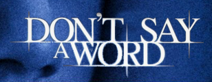
This looks like someone had a alot of fun - taking ITC Garamond Condensed and adding "tears" - Second thought - it might have been Century....
Edited on Aug 11, 2013 at 15:04 by Heron2001
Edited on Aug 11, 2013 at 15:04 by Heron2001
Sorry, this is all from scratch.
Coffeeboy,
I don't think there is a "base" font - this could be based on someone's own handwriting - and perhaps they made a font of it for their own use.
I've looked to see what other fonts come close - and it's really hard. But perhaps, you can modify (with great strains) one of these to get the look you are going for.
Saxony Script: http://www.linotype.com/en/158393/SaxonyScript-family.html
Mr. Blaketon: http://myfonts.us/td-Y2Vxfy
or for something from dafont - that has sort of the same feelingWindsong: http://www.dafont.com/windsong.font?text=killerlovetour&psize=l

Identified font: Hoefler Text
When I saw this the other day - it reminded me of Industria because of the "I" but it really, really isn't. So I started to look and started thinking that maybe it was a custom, corporate font.
I couldn't find it - but I'll share with you two fonts I found that have a "similar" feeling and maybe can get you through your project.
On is called Conflict http://myfonts.us/td-VGrjK9 -- it was the "K" that drew me to it. The other is called Domestos Sans-Black - http://myfonts.us/td-yZaQxH and only because of it's "I" too...
Sorry I can't be more helpful. Good luck - I hope someone knows this and if not, it's easy enough for you to duplicate.
If this is a font - it is probably an OT one - with alternate "E" and "R"
But if it isn't and you are looking for something close - the closest I can think of is Freestyle Script - but honestly, it isn't very close at all... just the same feel. Take a peek - http://myfonts.us/td-WW7QbH
But if it isn't and you are looking for something close - the closest I can think of is Freestyle Script - but honestly, it isn't very close at all... just the same feel. Take a peek - http://myfonts.us/td-WW7QbH

You are welcome
You are most welcome.
I have a strange feeling this may have been handlettered. I just took a close look in photoshop - and it doesn't have certain characteristics I'm use to finding from a word done by a font. Sorry.

Not exact - but close if you need close.
Edited on Aug 06, 2013 at 14:01 by Heron2001
Suggested font: Proclamate
Edited on Aug 06, 2013 at 14:01 by Heron2001
ex-Bronxite? LOL HI...
Yes Lenwel is positive... if you look at your sample - you'll see the letters that repeat are never exactly the same...
Yes Lenwel is positive... if you look at your sample - you'll see the letters that repeat are never exactly the same...
You are very welcome. Thank you for getting back to me - I can mark it an exact response... wahoooo.
Good luck on your project.
Good luck on your project.
You are most welcome. Good luck on your project.

Identified font: Thor

Identified font: Sofia

Identified font: Dr Sugiyama


All times are CEST. The time is now 00:30
