
Forum
3,821 posts Identified fonts
Posts by donshottype

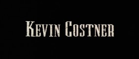
Identified font: Trajan

Identified font: Engravers

Identified font: Flange Medium
I knew I had seen this design before.
I agree that TC Europa could have perhaps been modified to make _KINGSLEY_.
BTW OPTI had a well made independent digitization of the old phototype era design for TC Europa, which it called Enraged.
I agree that TC Europa could have perhaps been modified to make _KINGSLEY_.
BTW OPTI had a well made independent digitization of the old phototype era design for TC Europa, which it called Enraged.

Tiny serifs like Serpentine, but it's not Serpentine.
Compare to your image, reverse slanted to make it upright:

Looks sort of familair, but...
Edited on Jun 23, 2017 at 15:20 by frd
Compare to your image, reverse slanted to make it upright:
Looks sort of familair, but...
Suggested font: Serpentine
Edited on Jun 23, 2017 at 15:20 by frd

Textile, by Apple. Not sold at retail.
Redrawn with added connectors and minor changes, esp in _c_ and _a_
Here is the original

Edited on Jun 20, 2017 at 14:29 by donshottype
Redrawn with added connectors and minor changes, esp in _c_ and _a_
Here is the original
Identified font: Textile
Edited on Jun 20, 2017 at 14:29 by donshottype
Compare to HFF Greek ExCon. a free font here at Dafont, with width expanded to 180 percent.

Closer than my other suggestions, but note that THIS IS NOT THE FONT.
Edited 2 times. Last edit on Jun 20, 2017 at 11:23 by donshottype
Closer than my other suggestions, but note that THIS IS NOT THE FONT.
Suggested font: HFF Greek ExCon
Edited 2 times. Last edit on Jun 20, 2017 at 11:23 by donshottype
See also Captain Blackbeard. It could be used as an approximate substitute, but note that THIS IS NOT THE FONT.
Suggested font: Captain Blackbeard
The tiles in _Dances with Wolves_ -- more at http://annyas.com/screenshots/updates/dances-with-wolves-1990-kevin-costner/ -- are in a 19th century chamfered style then called Grecian. There are a few digital revivals of the style, but most of them do not have the thick and thin [high contrast] strokes in the DWW titles.
An exception is OL Grecian Modern, as shown at MyFonts. It could be used as an approximate substitute, but note that THIS IS NOT THE FONT
An exception is OL Grecian Modern, as shown at MyFonts. It could be used as an approximate substitute, but note that THIS IS NOT THE FONT
Suggested font: Grecian Modern

Identified font: Impact

Press Gothic is too wide and the counters too open, but could otherwise be used as an approximate substitute.
Suggested font: Press Gothic

Edited:
A: bottom crossbar deleted
III: this is _iii_ with the dots deleted and the height increasted
M: this is _3_ rotated left 90 degrees
e: this is 3 flipped and mirrored
Scale of _motte_ is larger than _Act III_
A: bottom crossbar deleted
III: this is _iii_ with the dots deleted and the height increasted
M: this is _3_ rotated left 90 degrees
e: this is 3 flipped and mirrored
Scale of _motte_ is larger than _Act III_
Identified font: Cloister Black

Identified font: Druk Condensed X Super

Identified font: OCR A
Perhaps made from mixing the heavier weights of Tungsten Narrow and editing.
Here is a custom intermediate weight slightly closer to black than to bold, with width reduced to 84% and negative vertical bolding of 12 to a version scalled to an X height of 700.
Converted to negative to facilitate comparison with your image.

Pretty close to the letters in the image.
Edited 2 times. Last edit on Jun 17, 2017 at 17:52 by donshottype
Here is a custom intermediate weight slightly closer to black than to bold, with width reduced to 84% and negative vertical bolding of 12 to a version scalled to an X height of 700.
Converted to negative to facilitate comparison with your image.
Pretty close to the letters in the image.
Suggested font: Tungsten
Edited 2 times. Last edit on Jun 17, 2017 at 17:52 by donshottype
The _@_ is a match for Cooper Black, as shown in the URW version.
Edited 2 times. Last edit on Jun 17, 2017 at 18:26 by jerseygirl
Edited 2 times. Last edit on Jun 17, 2017 at 18:26 by jerseygirl
Charter Black has about the right weight and proportions, but would need rounded serifs and terminals to be a match. See the red overlay on the _l_:

Possibly _Billy!_ is an edited Charter Black
Possibly _Billy!_ is an edited Charter Black

Another approximation, not heavy enough.
DL link is half way down the page
Edited on Jun 16, 2017 at 10:44 by donshottype
DL link is half way down the page
Suggested font: Legal Tender
Edited on Jun 16, 2017 at 10:44 by donshottype
All times are CEST. The time is now 11:42
