
Forum
13,584 posts Identified fonts Requests only
Posts by Heron2001

I believe this was handtailored for the Disney film.
It can be recreated with a font like - ITC Elan Bold - http://myfonts.us/td-pegHzD
It can be recreated with a font like - ITC Elan Bold - http://myfonts.us/td-pegHzD
The "E" is from the Regular - and I have a feeling the sample is a few generations away from the font - making it appear heavier...
Suggested font: Engravers

Identified font: Topsy Turvy
Not all Poster Bodoni's are the same... this one is closer to your sample - because of the letter "t"
http://myfonts.us/td-mCjwHa
http://myfonts.us/td-mCjwHa
You are most welcome.
It looks like two different fonts. The top one Iain - is a slab serif, while the bottom one Joycie - is a san serif.


There are a few you can make this logo from like:
Code Bold: http://www.dafont.com/code.font?text=MOJANG
Opificio Bold: http://www.dafont.com/opificio.font?text=MOJANG
or the commercial font: Insignia.
Edited on Jan 26, 2020 at 12:27 by marty666
Code Bold: http://www.dafont.com/code.font?text=MOJANG
Opificio Bold: http://www.dafont.com/opificio.font?text=MOJANG
or the commercial font: Insignia.
Suggested font: Code
Edited on Jan 26, 2020 at 12:27 by marty666
You are most welcome.

Identified font: Black boys on mopeds


Suggested font: Poster Bodoni Italic
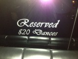
Identified font: Vivaldi

Identified font: Flemish Script

Identified font: Legend M54
The bulk is Neutraface...
The "E" looks like it came from the alternative Avant Garde font.
The "E" looks like it came from the alternative Avant Garde font.
Suggested font: Neutraface Display Light
You are most welcome Nike - and thank you!
It looks like someone borrowed Laserian - filled in the white on the letters and then obliqued it.
THIS IS NOT THE FONT (for those of you that like to mark NO)
http://www.dafont.com/laserian.font?text=CUBE
Edited on Nov 20, 2013 at 17:28 by Heron2001
THIS IS NOT THE FONT (for those of you that like to mark NO)
http://www.dafont.com/laserian.font?text=CUBE
Suggested font: Laserian
Edited on Nov 20, 2013 at 17:28 by Heron2001
These are not that close... but may do for your purposes...
Alpaca54: http://www.dafont.com/alpaca54.font?text=CORNELIA+AND+CO.
Designosaur: http://www.dafont.com/designosaur.font?text=CORNELIA+AND+CO.
Alpaca54: http://www.dafont.com/alpaca54.font?text=CORNELIA+AND+CO.
Designosaur: http://www.dafont.com/designosaur.font?text=CORNELIA+AND+CO.
All times are CEST. The time is now 20:45
