
Forum
13,584 posts Identified fonts Requests only
Posts by Heron2001


Suggested font: Meta Black

Identified font: Coaster Black

Identified font: Club Type Medium
It does look like a member of someone's idea of what a Times Roman is... but that does not match.
Are you by any chance on a MAC? If so, it appears this might be a MAC OS font - by the name of Blau Kai. (BiauKai.dfont) --
Are you by any chance on a MAC? If so, it appears this might be a MAC OS font - by the name of Blau Kai. (BiauKai.dfont) --
Suggested font: Elephant Oblique
If no one can find the original for you - perhaps one of these will do the trick:
http://www.dafont.com/theme.php?cat=602&text=rat%F3n&fpp=50
http://www.dafont.com/theme.php?cat=602&text=rat%F3n&fpp=50

Identified font: Yorkville

Identified font: TF Arrow
Thanks Fred - maybe it's my eyes - but it looked fine to me.... lol
I wonder if that's what happened to another one I solved yesterday too... oh my! And to think I had my eyes examined twice this year already!
I wonder if that's what happened to another one I solved yesterday too... oh my! And to think I had my eyes examined twice this year already!
You are welcome. Good luck with your project.
It looks like you can take the letter C (or perhaps E) and turn it 90 degrees counterclockwise - and then add to it.

It seems to be close to Bitstreams' Unknown Caller font... not exact but great in a pinch (and easy to fix up)
THIS IS NOT EXACT!
THIS IS NOT EXACT!
Suggested font: Unknown Caller
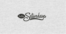
Identified font: Delight Script
Identified font: Legothic Bold

This was asked yesterday by someone - and I don't know what happened to that thread. But the answer is... HUMMINGBIRD.
Identified font: Hummingbird

For San Antonio
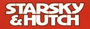
Also acceptable - is Microgramma Bold Extended. http://myfonts.us/td-BiKNbO
Edited on Dec 05, 2013 at 15:10 by drf
Also acceptable - is Microgramma Bold Extended. http://myfonts.us/td-BiKNbO
Identified font: Eurostile Bold Extended #2
Edited on Dec 05, 2013 at 15:10 by drf

It's very small - but it reminds me of Bookman with Swashes.
Edited on Dec 04, 2013 at 17:45 by drf
Suggested font: Bookman
Edited on Dec 04, 2013 at 17:45 by drf
Recommendation: Dave Gibbons Lower
http://myfonts.us/td-vcUV26
http://myfonts.us/td-vcUV26
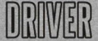
Identified font: Steelfish
All times are CEST. The time is now 20:45
