
Forum
3,821 posts Identified fonts
Posts by donshottype

Identified font: Modern No. 20
License plate is really close for most letters including the _S_ with the subtle kink in the diagonal.
Can notice differences in _W_ -- apex more robust in the sign, and _A_ -- legs splayed more in sign.
Can notice differences in _W_ -- apex more robust in the sign, and _A_ -- legs splayed more in sign.
Seems handlettered for a logo rather than a font, but the ID of Horizon is spot on as the source of inspiration of the letters, including the alt _s_ mentioned by Jackie.

@Neus050901 You did not mention a the name of a font 
But I recognize this as Futura Condensed Extra Bold

But I recognize this as Futura Condensed Extra Bold
Identified font: Futura Condensed ExtraBold

Another option for the unspurred letters is Westside. It has a stronger reverse contrast than P.T. Barnum. The _S_ diagonal is too boxy.
Suggested font: Westside
AFAIK, No digital match.
Belgian has spurs or spikes at the top and bottom of the letters but is not a reverse contrast French Clarendon or Barnum like the base letters.
The closest I found to them is P.T. Barnum. With the addition of spurs or spikes at the top and bottom of the letters it would look fairly close to _Spiel..._
Suggested font: Barnum

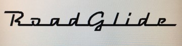
Plenty of variation in repeating letters of this monoline script suggests that this is hand lettered.
Search on Creative Market for handwritten scripts and you can find some passable substitutes.
Search on Creative Market for handwritten scripts and you can find some passable substitutes.
Suggested font: Ballpoint Script
Perhaps made by stretching the width of Futura Extra Bold Oblique and doing some editing.
Edited on Jul 19, 2017 at 11:09 by donshottype
Suggested font: Futura ExtraBold Oblique
Edited on Jul 19, 2017 at 11:09 by donshottype

Identified font: Neutraface
I can see the similarity to Pill Gothic, but at this resolution can't say for certain.
Can spot at least two apparent differences. In the image the tip of the center horizontal stroke of _E_ seems to line up with top & bottom horizontal stokes. In Pill Gothic it is shorter.
In the image the hasthtag _#_ is small and at mid letter height. In Pill Gothic it extends from the baseline to almost full height.
In any evewnt, Pill Gothic has the correct flavor to recreate something close to the secondary subtitle.

Not a close match for weights of bordering lines, but an interesting alternative.
Edited 2 times. Last edit on Jul 18, 2017 at 22:34 by donshottype
Suggested font: Collegiate FLF
Edited 2 times. Last edit on Jul 18, 2017 at 22:34 by donshottype
A match, if width is reduced slightly
Edited on Jul 18, 2017 at 22:35 by donshottype
Identified font: Varsity
Edited on Jul 18, 2017 at 22:35 by donshottype
Close but not 100%, e.g. gap between terminals of _S_ and center strokes is too tight.
Edited on Jul 18, 2017 at 22:33 by donshottype
Suggested font: Collegiate Heavy Outline
Edited on Jul 18, 2017 at 22:33 by donshottype
Kramer, digitized by D Rakowski in 1991. The designer of the predigital Art Nouveau alphabet is unknown.
No legitimate download.
No legitimate download.

Relettered slightly compressed version of Morris Fuller Benton's Engravers Old English or Wedding aka Linotext.
Various minor differences.
Various minor differences.
Suggested font: Linotext
Identified font: Raceway
Compress the width of IFC Rail Road and you have the sign.

Made heavier and edited by cutting gaps in _A_, _D_ and _R_
Edited on Jul 18, 2017 at 09:39 by donshottype
Suggested font: Handel Gothic
Edited on Jul 18, 2017 at 09:39 by donshottype

Available fonts can give you an up and down fluctuation like an ecg or curves like a neon sign.
Your image looks like something an oscilloscope could produce if a sine wave was transformed by a second order sine wave.
I can't recall the equation.
Getting font letters to behave in this way would take a lot of customization.
Letter height would range from very short to very tall [amplitude] but width would be the same [frequency].
Could be done manually by having a collection of perhaps a dozen fonts from short to tall and the user would pick letters from them to follow the amplitude of the sine curve.
Would work best for a connected monoline script.
AFAIK nobody has produced a font collection that could do this.
Edited 3 times. Last edit on Jul 17, 2017 at 21:38 by donshottype
Your image looks like something an oscilloscope could produce if a sine wave was transformed by a second order sine wave.
I can't recall the equation.
Getting font letters to behave in this way would take a lot of customization.
Letter height would range from very short to very tall [amplitude] but width would be the same [frequency].
Could be done manually by having a collection of perhaps a dozen fonts from short to tall and the user would pick letters from them to follow the amplitude of the sine curve.
Would work best for a connected monoline script.
AFAIK nobody has produced a font collection that could do this.
Suggested font: ECG Saji
Edited 3 times. Last edit on Jul 17, 2017 at 21:38 by donshottype
All times are CEST. The time is now 14:04
