
Forum
3,821 posts Identified fonts
Posts by donshottype


With custom _G_ and several minor modifications, such as clipping the bulge from inside the counter on _o_.
Suggested font: Heritage
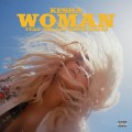
Slope of letters varies. Connectors vary.


Identified font: Grobold

Identified font: ITC Blair

Identified font: Soap

Suggested font: Denver Bold
Suggested font: Bernase Roman

Probably custom, note the reverse contrast, i.e. horizontal strokes thicker than the vertical ones, an effect produced by condensing letters.
Perhaps made from further condensing Player Condensed Black, clipping the top rhs serif from _A_, converting the chamfered corners into curves, and various minor tweeks.
Edited on Jul 27, 2017 at 16:57 by donshottype
Perhaps made from further condensing Player Condensed Black, clipping the top rhs serif from _A_, converting the chamfered corners into curves, and various minor tweeks.
Suggested font: Player Condensed Black
Edited on Jul 27, 2017 at 16:57 by donshottype

It's possible that this was done as a filmtype but more likely it was hand lettered.
It's in the general style of Howard Trafton's Quick [Aka Trafton Script] but transformed from the free standing metal type into a connecting script. Trafton is also the inspiration for several digital revivals including Pacific Script and Parfum. Note that they are NOT THE FONT for _Levittown_, merely suggestions for a substitute in similar style.
Edited on Jul 27, 2017 at 04:36 by donshottype
It's in the general style of Howard Trafton's Quick [Aka Trafton Script] but transformed from the free standing metal type into a connecting script. Trafton is also the inspiration for several digital revivals including Pacific Script and Parfum. Note that they are NOT THE FONT for _Levittown_, merely suggestions for a substitute in similar style.
Suggested font: Parfum
Edited on Jul 27, 2017 at 04:36 by donshottype

Identified font: Captain Howdy

Tiny image makes 100% ID impossible.
However, it's almost certainly Bodoni Bold.
However, it's almost certainly Bodoni Bold.
Suggested font: Bodoni Bold

In 1977, when this Star Wars pyramid logo was designed, there was no font that would be the obvious inspiration for the letters, although there was apparently a predigital Jay Gothic Extra Bold that had some similarities.
A recently released font [in 2014], Teko Bold, is closer, but is NOT THE FONT.
A recently released font [in 2014], Teko Bold, is closer, but is NOT THE FONT.
Suggested font: Teko Bold

Identified font: Eurostile

Identified font: Albertus
Trademarker Bold Italic edited to make the logo. Cut gaps in _O_ and _N_.
Identified font: Trademarker Bold Italic
The cover would have been made by a process called wood engraving. Everything hand lettered.
Fonts can appoximate some of the lettering styles. But making a replica is a major job
Fonts can appoximate some of the lettering styles. But making a replica is a major job


Perhaps the maker of the _TREO_ logo used Cowboy Western as the source.
+ Expanded the width
+ Clipped the tail on the leg of _R_
+ Copied a medial spur from the rhs of _O_ to the rhs of _R_
+ Added an inline.
+ Expanded the width
+ Clipped the tail on the leg of _R_
+ Copied a medial spur from the rhs of _O_ to the rhs of _R_
+ Added an inline.
Suggested font: Cowboy Western
All times are CEST. The time is now 09:46
