
Forum
2,244 posts Identified fonts Requests only
Posts by Hondo5834

Identified font: Burford Rustic


Identified font: Arkitech

Identified font: Anton

Identified font: Morganite

Identified font: Black Diamond


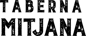
I'm guessing, this was built using multiple fonts.
From this font they used "Hzst".
From this font they used "Hzst".
Suggested font: Turbinado

Identified font: Clocksmith Italic

Can't find any legit download site...
Identified font: Murality

Identified font: Redrock

Identified font: Equinox

Identified font: Speeday

https://www.dafont.com/doublebass.font
Edited on Jun 13, 2025 at 03:29 by Hondo5834
Identified font: DoubleBass Bold
Edited on Jun 13, 2025 at 03:29 by Hondo5834

Identified font: Bukhari Script
yw

Identified font: Codec
All times are CEST. The time is now 12:04
