
Forum
9,165 posts Identified fonts Requests only
Posts by fmontpetit

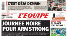
Je ne suis pas certain de la police du texte, mais à cette taille ça ressemble à Frutiger.
Suggested font: Frutiger

Suggested font: ITC Johnston

Identified font: Daleys Gothic

Identified font: Ubuntu Bold Italic
Identified font: Benguiat

Identified font: Futura Condensed Extra Bold
Identified font: Helvetica

Suggested font: URW Bodoni Antiqua

Identified font: Franklin Gothic

Suggested font: Eurostile

Suggested font: Bank Gothic

Chicago or maybe Pix Chicago on dafont: http://www.dafont.com/pix-chicago.font
Edited on Sep 11, 2012 at 00:53 by fmontpetit
Suggested font: Chicago
Edited on Sep 11, 2012 at 00:53 by fmontpetit

Suggested font: Gotham Extra Light


Identified font: Verdana

Identified font: Informal Black
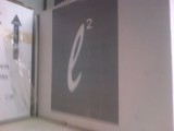
The "l" looks a lot like Brush Script. The "2", is hard to tell, but I'd say Mistral.
Edited on Sep 10, 2012 at 23:17 by fmontpetit
Suggested font: Brush Script
Edited on Sep 10, 2012 at 23:17 by fmontpetit

Identified font: Archer Bold
All times are CEST. The time is now 09:01
