
Forum
1,319 posts Identified fonts Requests only
Posts by elzadra


Identified font: Scriptina
Identified font: Quicksand Bold

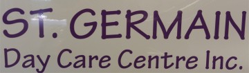
Ça me fait penser de Slipstream, mais je crois que ceci est fait exprès.
Edited on Apr 02, 2016 at 13:07 by frd
Suggested font: Slipstream
Edited on Apr 02, 2016 at 13:07 by frd

This was probably Caslon Black Swash. You can get some of this effect using Emfatick NF.
Identified font: Emfatick


Identified font: Emfatick
It's probably a sign painter's style, not a font. There used to be books of that kind of lettering, as examples for sign painting. Some were based on type fonts but a lot were not.
We're not holding out on you. They're not modern typographical fonts. I could do something close to this with Futura on the two lower lines and find some script roughly close to the McGowan's line, but it wouldn't be exact.
This is monumental lettering, not a typographical font. Look up Lombardic letters for the general style.
Identified font: Tekton Bold

Bebas Kai? (Sorry about the wrong ID.)
Edited on Mar 29, 2016 at 16:23 by frd
Suggested font: Bebas Kai
Edited on Mar 29, 2016 at 16:23 by frd

Suggested font: Carolyna Black
Identified font: Korinna

Suggested font: Flamenco


This may be Computer Modern:
https://en.wikipedia.org/wiki/Computer_Modern
Edited on Mar 22, 2016 at 09:49 by frd
https://en.wikipedia.org/wiki/Computer_Modern
Suggested font: Computer Modern
Edited on Mar 22, 2016 at 09:49 by frd
All times are CEST. The time is now 02:19
