
Forum
2,228 posts Identified fonts Requests only
Posts by 20121994


Identified font: Megrim

Identified font: カラット Std UB - Carat Std UB

Identified font: Tabi Super
marty666 said 
20121994 said
American Typewriter

It could be, I'm not sure but it could be.


Suggested font: Coperto

Identified font: Sandoval
Identified font: Diplomata SC
Suggested font: David
Identified font: 黄油溏心体 - ButterTangXin
Suggested font: Minstrel Poster

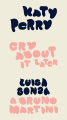
Identified font: KB Lucky Clover
Identified font: Hallo Oyster
LORDE...it seems to me the same font used for the SOLAR POWER logo, much sought after here on the Forum, or am I wrong?
Edited on Jun 11, 2021 at 11:12 by 20121994
Edited on Jun 11, 2021 at 11:12 by 20121994
jerseygirl said
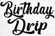
KB Pay The Lady
The font you suggest looks different to me, maybe I'm wrong.
marty666 said
Arial
CROCOP thanks
Zvonimir Team ideas?
Thanks

C'è qualcun altro in grado di aiutarmi?
Lettres e - t- P - i complètement différente, ça ne peut pas être une police.
Heron2001 said
Since this is a registered logo and it has two different As, it probably was designed for them. The closest I can find that has the "feeling" is Praegefest - and well, I think it's the desperation move. But...
Praegefest
Praegefest
First of all, thank you for the response, although as you have already anticipated, the font for the creation of such a logo, I think is other.
I'll try to work with what you suggest, better than nothing....
Thank you from the bottom of my heart, have a great day.
Edited on May 31, 2021 at 18:16 by 20121994
All times are CEST. The time is now 07:09
