
Forum
976 posts Identified fonts Requests only
Posts by APlaPi


Suggested font: Antique Central Black Extended

Suggested font: Zona Black


A mis manos llegó hace un tiempo una typografía muy similar, si no idéntica, llamada "GothicE". El problema es que no conozco su procedencia ni la fuente oficial.
Edited on Nov 02, 2016 at 15:18 by frd
Suggested font: GothicE
Edited on Nov 02, 2016 at 15:18 by frd

Suggested font: Cooper Bold Italic


Suggested font: Copperlate Gothic Bold
Recently, I haven't been able to get the permalink on MyFonts for answering identification requests. Does is happen to anyone else?
Identified font: Bauhaus Heavy
Thank you!!

Identified font: Flash

Identified font: Rage Italic

Identified font: Friday 13
I cannot find anything similar, specially with that same left pointing 'g' serif
Thaks a lot for the advice koeiekat!!
I'll try FontForge to properly set the kerning in my typographies and will submit them then hoping they'll be enjoyed!
I'll try FontForge to properly set the kerning in my typographies and will submit them then hoping they'll be enjoyed!
I got my problem solved there. I know kerning is all about adapting the space between glyphs to make it look smooth and natural but thought that to get there one had to handle the character width searching the best to fit with any combination. As I'm self-taught in this I hadn't come across the fact there is actually some parameters in the font that set the ''kerning pairs'. Now I know 
Also, the tools I use (CorelDRAW & YTypeLight) don't have this option available.. I'll search for some other software.
Thanks again and sorry to have bothered you all with my ignorance!

Also, the tools I use (CorelDRAW & YTypeLight) don't have this option available.. I'll search for some other software.
Thanks again and sorry to have bothered you all with my ignorance!
#5 I wasn't aware of that. Thanks claudeserieux
#6 I know what kerning is, what I don't know is the mistakes in it, seeing that my fonts work well (at least on the pcs i've tried it, don't know about mac). Thanks anyway
#6 I know what kerning is, what I don't know is the mistakes in it, seeing that my fonts work well (at least on the pcs i've tried it, don't know about mac). Thanks anyway
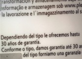
#2 So frd, the mistake is on the image attached! I wouldn't have imagined that would be a problem!!
Thanks fot the tip, it was driving me nuts!
#3 Koeiekat yes, the submitted version of Calculative has no info within it and actually may be a symbol font because I made it long ago and the file wasn't totally finished, but just enough to be set free
Thanks fot the tip, it was driving me nuts!
#3 Koeiekat yes, the submitted version of Calculative has no info within it and actually may be a symbol font because I made it long ago and the file wasn't totally finished, but just enough to be set free
Hi everyone.
I'm a type designer whose fonts are constantly being rejected for alleged kerning issues. I'd like to know what the overall requirements regarding kerning are, because I've came across tons of fonts with some horrid kerning and I think the ones I create are fair to say the least. I try to 'polish' my typefaces edges, shapes and specially kerning, in which I work for more than a couple hours if needed to get it as close to perfect as I possibly can.
If somebody has some info. regarding this I'd be thankful to check every point of it so as to be able to share the fonts I delightedly craft with everyone who might enjoy them.
Thanks
(and sorry if there's some blunder with the english)
All times are CEST. The time is now 13:12
