
Forum
484 posts Identified fonts Requests only
Posts by kriskendall99


Identified font: Press Start
You're welcome!

Identified font: Helvetica Neue

Identified font: Courier New

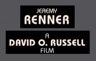
Identified font: Legend M54

The rest of the text looks really similar to this, but the o's are wrong. Maybe those are taken from Gotham Thin.
Suggested font: Gotham Narrow Thin
Identified font: Tondu

Identified font: Wisdom Script

Identified font: Impact
I don't think this is a font. Notice how the E's and the P's don't match.
Identified font: Bauhaus
You're welcome! 


Identified font: Freestyle Script

Suggested font: Eurostile
You're welcome!

Correction. It seems to actually be this. The one I suggested before is a good free alternative, though.
Edited on Feb 19, 2014 at 20:01 by kriskendall99
Identified font: Script MT
Edited on Feb 19, 2014 at 20:01 by kriskendall99
Suggested font: Buffalo Nickel

Identified font: Duality

Suggested font: Harabara Mais
All times are CEST. The time is now 02:34
