
Forum
1,070 posts Identified fonts
Posts by SexyElvis7

Identified font: Revolution II
Identified font: UCU Charles Script


Identified font: Playbill
Looks custom, probably not a font


Identified font: Nilland

Identified font: D3 Circuitism Oblique
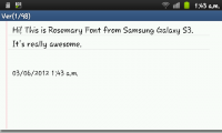
I'll go on a limb and venture a guess that this might possibly be a font named Rosemary and it is bundled with Samsung Galaxy S3.
You can get it as a TTF to use on another Android phone or on a PC at XDA
You can get it as a TTF to use on another Android phone or on a PC at XDA
Identified font: Rosemary

Grapple BRK
The older version has the odd looking A and a similar H
http://www.dafont.com/grapple-brk.font?text=JASON
There's a newer version on Cheap Pro Fonts
http://www.cheapprofonts.com/Grapple_BRK_Pro.php
From the description - Another very squarish and futuristic font from Brian Kent. This time I've kept the very thin style of the diacritics, but I have redesigned the A and H (and a couple of other letters and glyphs - mostly to give them a little more "meat". And then added the usual plethora of accented letters for our unique language support, of course.
Edited 2 times. Last edit on Jan 21, 2013 at 23:32 by SexyElvis7
The older version has the odd looking A and a similar H
http://www.dafont.com/grapple-brk.font?text=JASON
There's a newer version on Cheap Pro Fonts
http://www.cheapprofonts.com/Grapple_BRK_Pro.php
From the description - Another very squarish and futuristic font from Brian Kent. This time I've kept the very thin style of the diacritics, but I have redesigned the A and H (and a couple of other letters and glyphs
 - mostly to give them a little more "meat". And then added the usual plethora of accented letters for our unique language support, of course.
Identified font: Grapple BRK
Edited 2 times. Last edit on Jan 21, 2013 at 23:32 by SexyElvis7
Suggested font: Courier New Italic


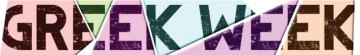
Dirty Headline with a stroke/outline applied to exaggerate the erosion effect

Identified font: Dirty Headline
Suggested font: Rockwell

Identified font: Techno Hideo

Identified font: Geogrotesque Bold Italic
Identified font: RixLovefool BB
Identified font: Hasty Pudding

SashiX said 
Please provide link to that web page.
http://en.wikipedia.org/wiki/Nederland_1
Edited on Jan 17, 2013 at 21:23 by SexyElvis7
All times are CEST. The time is now 16:20
