
Forum
617 posts Identified fonts Requests only
Posts by notfon1234
It appears to be Century Gothic but it looks thinner than usual...
Identified font: Algerian
It looks a little like SF Old Republic or Gotham. Both are slightly different.


Thanks a TON rocamaco!
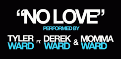
Anyone know what font this is?


"The Perfect Change."
Edited on Jun 14, 2011 at 01:48 by rocamaco
Identified font: FreeSet Condensed Demibold
Edited on Jun 14, 2011 at 01:48 by rocamaco
azumanga1 said 
Disagree entirely -- the "f" here is different than the "f" in the example. Most likely an original logo, based on Europe Underground or similar.
It was the closest I could find
 most likely it is a custom job.
Edited on Jun 13, 2011 at 04:03 by notfon1234

Everything except "french"
Edited on Jun 12, 2011 at 23:57 by notfon1234
Identified font: Copperplate Gothic
Edited on Jun 12, 2011 at 23:57 by notfon1234

It looks sorta like Gotham Light except for the "t"
Edited on Jun 12, 2011 at 22:14 by notfon1234
Suggested font: Gotham Light
Edited on Jun 12, 2011 at 22:14 by notfon1234

It looks like Helvetica Neue with filled spots in the B,D,O,R,A,and P. It's pretty easy thing to do in Photoshop.
Suggested font: Helvetica Neue Bold
It looks like Bank Gothic but modified. I don't think this is a real font.
Look on these for similar ones:
http://new.myfonts.com/WhatTheFont/forum/case/207981/
http://answers.yahoo.com/question/index?qid=20081101164312AABRpUF
http://new.myfonts.com/WhatTheFont/forum/case/207981/
http://answers.yahoo.com/question/index?qid=20081101164312AABRpUF
The letters don't touch. The designers modified the kerning. Kerning is the space between letters. So if you decrease it, like in the photo then it will make the letters touch.
Edited 3 times. Last edit on Jun 12, 2011 at 00:56 by notfon1234
Identified font: Helvetica Neue Bold
Edited 3 times. Last edit on Jun 12, 2011 at 00:56 by notfon1234
SashiX said
Humanist 777? Frutiger? 
BTW, that roundness is because of the printer, and not the letter itself
Humanist 777 (black and/or condensed)

BTW, that roundness is because of the printer, and not the letter itself
Humanist 777 (black and/or condensed)
 I totally agree now that you pointed that out.
 I think it's not a font. If you look hard enough you can find a few look-alikes though.


Suggested font: Calibri Bold
All times are CEST. The time is now 06:13
