
Forum
3,821 posts Identified fonts
Posts by donshottype

Custom for SONY.
You can get pretty close if you compress the height of Clarendon No 1 URW Medium to 80 percent:

You can get pretty close if you compress the height of Clarendon No 1 URW Medium to 80 percent:

Would have been custom designed by or for the architect in 1909 -- non-standard use of Roman Numerals, usually written as MCIX.
AFAIK, no matching digital font.
A few digital fonts, like Beaufort, have low contrast strokes and similar flared tiny serifs. It could be used to approximate this alphabet, but IT IS NOT A MATCH.
AFAIK, no matching digital font.
A few digital fonts, like Beaufort, have low contrast strokes and similar flared tiny serifs. It could be used to approximate this alphabet, but IT IS NOT A MATCH.
Suggested font: Beaufort

Using Sailor Jerry

Can't find a legitimate download.
The image letters are handwritten copies of the Sailor Jerry letters.
Edited 2 times. Last edit on Nov 25, 2018 at 19:39 by donshottype
Can't find a legitimate download.
The image letters are handwritten copies of the Sailor Jerry letters.
Identified font: Sailor Jerry
Edited 2 times. Last edit on Nov 25, 2018 at 19:39 by donshottype

Utopia Semibold Display with the letter _O_ rotated 24 degrees left.
Same request at:
https://www.dafont.com/forum/read/386297/what-the-font-plis
Edited on Nov 21, 2018 at 20:02 by donshottype
Same request at:
https://www.dafont.com/forum/read/386297/what-the-font-plis
Suggested font: Utopia Semibold Display
Edited on Nov 21, 2018 at 20:02 by donshottype

Utopia Semibold Display with the letter _O_ rotated 24 degrees left.
More letters -- _DONE_ -- from the same font are at:
https://www.dafont.com/forum/read/385167/jennie-solo-font
Edited 2 times. Last edit on Nov 21, 2018 at 19:59 by donshottype
More letters -- _DONE_ -- from the same font are at:
https://www.dafont.com/forum/read/385167/jennie-solo-font
Suggested font: Utopia Semibold Display
Edited 2 times. Last edit on Nov 21, 2018 at 19:59 by donshottype
Rotate the _O_ 24 degrees right and _SOLO_ looks like this:

The _J_ in _JENNIE_ also looks edited.
Edited on Nov 21, 2018 at 19:57 by donshottype
The _J_ in _JENNIE_ also looks edited.
Edited on Nov 21, 2018 at 19:57 by donshottype

Le Jeune is Commercial Type's public release of a version of the Didot that it designed for Vanity Fair.
See esp Le Jeune Deck for the closest to the font in your image.
See esp Le Jeune Deck for the closest to the font in your image.
Suggested font: Le Jeune
Per font info on the Vanity Fair website, this is VF-Didot-3-Web-Bold and VF-Didot-3-Web-Bold-Italic.
For a substitute use any of several Didot's.
For a substitute use any of several Didot's.
Identified font: Vanity Fair Didot

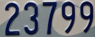
Looks like a version of Letter Gothic, except that the zero is narrower.
Suggested font: Letter Gothic
Close but not a 100% match.
Edited on Nov 10, 2018 at 08:52 by donshottype
Suggested font: Arial Monospaced
Edited on Nov 10, 2018 at 08:52 by donshottype
License Plate USA is a similar font based on North American car fonts, but is NOT AN EXACT MATCH.
Suggested font: License Plate USA
Agree that the letters seem to have originated with Full Slab.
Paste the macron on the top of _A_ to make a serif, and paste a serif at the lrhs of N and you get:

I used Full Slab Book weight, which is currently free at Myfonts.
You can get a closer match if you use a heavier weight of Full Slab and compress the width slightly.
Edited on Nov 09, 2018 at 10:12 by donshottype
Paste the macron on the top of _A_ to make a serif, and paste a serif at the lrhs of N and you get:
I used Full Slab Book weight, which is currently free at Myfonts.
You can get a closer match if you use a heavier weight of Full Slab and compress the width slightly.
Edited on Nov 09, 2018 at 10:12 by donshottype
Custom blend of Univers 67 (Bold Condensed) and Futura Bold, according to the logo designer, Lindon Leader
See interview with him:
http://www.thesneeze.com/mt-archives/000273.php
See interview with him:
http://www.thesneeze.com/mt-archives/000273.php

Perhaps hand-lettered for the band.
Looks like a hybrid of the letters in runic/ancient Greek fonts and something like Brownie. A light weight of Brownie is available at https://www.1001fonts.com/brownie-font.html
The double strokes evoke the tone of Rennie Mackintosh/Arts and Crafts letters.
Looks like a hybrid of the letters in runic/ancient Greek fonts and something like Brownie. A light weight of Brownie is available at https://www.1001fonts.com/brownie-font.html
The double strokes evoke the tone of Rennie Mackintosh/Arts and Crafts letters.
Suggested font: Brownie

Identified font: Doobie
Psi Hoe Pate said 
This is Farao Black
Farao Black
Farao Black
Farao Black is not the font because it does not include a Cyrillic alphabet.
However, the letters in the Rolling Stone headline and RS_Egyptian look like they are derived from Farao Black.
Compare them to these letters from Farao Black:

Psi Hoe Pate said
Looks like a match. The character set is labelled:
RS_Египетский i.e. RS_Egyptian.
The "RS" is probably Rolling Stone.
So this seems to be a private font for Rolling Stone.
UPDATE:
However, there are a few differences between RS_Египетский shown in the link and the font actually used in the magazine.
Note the ball terminals upper right of Ka _к_, and upper left and right of Zhe _ж_.
Edited 3 times. Last edit on Nov 03, 2018 at 18:13 by donshottype
All times are CEST. The time is now 04:33
