
Forum
47 posts Identified fonts
Posts by stewf


Not a match, but you might enjoy Kamikaze.
Edited on Aug 25, 2021 at 06:39 by frd
Suggested font: Kamikaze
Edited on Aug 25, 2021 at 06:39 by frd

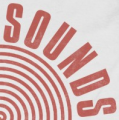
Identified font: Agentur
Compacta. There are several versions from different labels. This seems to match ITCs or Compacta Regular or Scangraphics SH Regular: https://www.myfonts.com/fonts/efscangraphic/compacta-sh/
Identified font: Compacta
Ah, good catch. Then it was the designers of By the way that corroded Compacta.
True! But to be clear, ESP is a font inspired by the logo. Its not what the designers of the ESPN logo used. Also, its proportions and weight do not match the logo.

My guess is they started with Premier Shaded, removed the shadow and adjusted some shapes.
Suggested font: Premier Shaded
See also the original, metal version of Clearface: https://archive.org/details/americanspecimen00amerrich/page/306/mode/2up?view=theater

I believe this is ITC Clearface. If it doesnt match the digital version exactly its probably because the phototype varied, or it was modified for the logo or packaging.
Suggested font: Clearface
Identified font: Neutraface

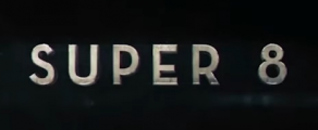
Identified font: Druk Wide Bold


This is custom lettering, not a font. It may have been loosely inspired by Stop: https://fontsinuse.com/typefaces/6943/stop
You might also like Logotype.
Edited on Aug 24, 2021 at 06:32 by frd
You might also like Logotype.
Suggested font: Logotype
Edited on Aug 24, 2021 at 06:32 by frd

These metal logos are almost always hand lettered (not using fonts), but if you want this look without hiring a lettering artist, Doubletwo Studios is the place to go, and thats where this band went!
Identified font: XXII Daemon


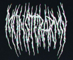
This is most likely hand lettering, not a font. You might like:
Monster Mash https://www.fontspring.com/fonts/comicraft/monster-mash
B-Movie Retro https://www.myfonts.com/fonts/typonauten/b-movie-retro/
Feast of Flesh https://www.fontspring.com/fonts/blambot/feast-of-flesh-bb
Edited 2 times. Last edit on Aug 24, 2021 at 06:23 by frd
Monster Mash https://www.fontspring.com/fonts/comicraft/monster-mash
B-Movie Retro https://www.myfonts.com/fonts/typonauten/b-movie-retro/
Feast of Flesh https://www.fontspring.com/fonts/blambot/feast-of-flesh-bb
Suggested font: B-Movie Retro
Edited 2 times. Last edit on Aug 24, 2021 at 06:23 by frd


This logo is a pretty sloppy modification of Bookman, as others have suggested. If you want the best version of Bookman with swashes, see Bookmania.
Suggested font: Bookmania
This is custom lettering (not a font) by Gustavo Eandi: https://www.instagram.com/p/CQYq-9mhNlp/

oofas was on the right track with a Microsoft font, but its a different (and uglier) one: Trebuchet.
Identified font: Trebuchet
All times are CEST. The time is now 06:03
