
Forum
35 posts Requests only
Posts by brettallica

I am looking for the fonts for "Seahorse Swim School, Inc." and "Santa Cruz County, California" so that I can vectorize the logo. Thank you.

Edited 2 times. Last edit on May 24, 2017 at 10:22 by frd
Edited 2 times. Last edit on May 24, 2017 at 10:22 by frd
Any idea what this font is? It's some kind of stencil. Thanks.

Thank you! I actually tried Impact for the "Action" text, but it didn't seem to line up quite right. I'll give it another shot. Maybe I missed something.
The "Carpet & Upholstery Cleaning" was pretty accurate, so I'll run with it as you have suggested. I had to do some kerning adjustment, but nothing too extraordinary.
The "Carpet & Upholstery Cleaning" was pretty accurate, so I'll run with it as you have suggested. I had to do some kerning adjustment, but nothing too extraordinary.
Can anyone spot these fonts?
I need both "Action" and "Carpet & Upholstery Cleaning"
Thanks!

I need both "Action" and "Carpet & Upholstery Cleaning"
Thanks!
You're amazing! Thank you!
Hi guys,
Back again with a doozie! Does anyone have any idea what font this is? This is the best resolution I could find, and that scratchy effect isn't helping the automated online tools. I tried filling it in to have a consistent and solid block of color, and I've also traced the outlines and made solid letters, to no avail. Hopefully it rings a bell with someone.
Thanks in advance for your help.
Thanks. I also think that is very close; it seems closer than Montag anyway. I've overlaid that font and played with some kerning and character width and I've got it pretty darn close. It seems like each character requires its own unique level of horizontal scaling, but I think this is the right path. Thank you.
Edited on Oct 26, 2016 at 02:18 by brettallica
Edited on Oct 26, 2016 at 02:18 by brettallica
Does anyone have a solid idea for the font(s) found on this logo? I'm not really banking on there being one for the script portion, but if there is I would love to know it. I'd be satisfied re-drawing that but then knowing the "RUBIKS.COM" part. The closest I have found is Montag (black), but it's slightly off particularly in the R and K characters.
http://myfonts.us/td-Zzuamt

Edited on Oct 25, 2016 at 21:11 by brettallica
http://myfonts.us/td-Zzuamt
Edited on Oct 25, 2016 at 21:11 by brettallica
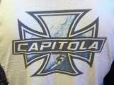
I am redesigning this logo for a client, and this is apparently the only image in existence of it. Good times! I was hoping that someone out there could identify the "Capitola" font in there so that I wouldn't have to re-draw it, and so that we can continue the branding with other articles of apparel and various accessories (e.g. stickers and badges) with that same font. Any ideas?
Thanks in advance for your guys' help.
Thanks in advance for your guys' help.
@Heron2001 and @donshottype,
Thanks to both. A few days ago, I traced the lettering in both Photoshop and Illustrator (I did it in both programs as separate attempts in an effort to weed-out mistakes and/or just get the best possible example) to the best of my ability and got nice vectors from it, and then plugged both versions into the What the Font machine. It spit out Clarendon as well. As you both have mentioned, there are certainly some obvious differences in the original Clarendon font and this image, which may be partially or greatly attributable to an out of focus image. The negative space in the B is also a huge difference between the two, which hasn't specifically been mentioned. This image was the best one that I could find for its intended application, and believe me, I did my due diligence by finding the best example that I could. I've seen other literature by this company that suggests that the lettering is "less rounded" than it appears here and that it is quite possibly Clarendon.
I do believe that Clarendon is nice starting point at the very least, when considering all of the factors that we've got going on. I would just ask the company, but this division of the company has been out of business for 35 years!
I like that! Thanks! What do you think about Microgramma vs. the Aban font example that I linked earlier?
Hello!
Have a look at the attached image. I am having trouble finding the font used for the "BIC Venturi" as seen here. I think it's close to Aban, but I'm not 100% certain. It's definitely the best match that I have seen so far. It also has similarities to Bank Gothic, but it's definitely not a perfect match to that.
Aban:
http://www.myfonts.com/fonts/naghachian/aban/
Text Preview with Aban:
http://myfonts.us/td-MMtDPT
Bank Gothic:
http://www.myfonts.com/fonts/bitstream/bank-gothic/
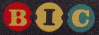
Hello!
Have a look at the attached image. I am having trouble finding the font used for the "BIC" in these colored circles. I think it's close to Volta, but it's not quite the same. I would prefer to use the authentic font as opposed to tracing it, so if anyone knows this one that would be great! I am also posting another one that will be going with the same project.
Have a look at the attached image. I am having trouble finding the font used for the "BIC" in these colored circles. I think it's close to Volta, but it's not quite the same. I would prefer to use the authentic font as opposed to tracing it, so if anyone knows this one that would be great! I am also posting another one that will be going with the same project.
Thanks for the amazingly fast reply! I didn't expect someone to figure this out so quickly.
I think this is probably the correct font, although I do see some differences when I overlay them. I'm guessing that this is mostly attributable to the fact that I'm comparing a crisp vector to a junky and pixelated JPG (my original source was a JPG so that's all I have). I also think that the original artist used a less-than-ideal spacing for this font, as this one clearly should have its letters connected (or at least quite a bit closer together).
I think this is probably the correct font, although I do see some differences when I overlay them. I'm guessing that this is mostly attributable to the fact that I'm comparing a crisp vector to a junky and pixelated JPG (my original source was a JPG so that's all I have). I also think that the original artist used a less-than-ideal spacing for this font, as this one clearly should have its letters connected (or at least quite a bit closer together).
I'm having a little trouble with this one. Does anyone have any ideas? See attached/below file. This is from a .jpg file that a customer is going to have me re-draw for them in vector format. I've tried What the Font (https://www.myfonts.com/WhatTheFont/), which I'm sure many of you may suggest right off the bat. That service can't seem to quite pin it down, though. It looks like this one might simply need a human's eye.
Thanks in advance for your help!

Thanks in advance for your help!
All times are CEST. The time is now 06:50
