
Forum
3,821 posts Identified fonts
Posts by donshottype

This seems to be based on Times Modern, which was pulled from distribution a few years ago.
Further information by Stephen Coles at http://fontsinuse.com/uses/3368/the-other-times-modern
Note the discussion of the Acne Jeans Logo.
Don
Further information by Stephen Coles at http://fontsinuse.com/uses/3368/the-other-times-modern
Note the discussion of the Acne Jeans Logo.
Don


Don't know if these letters are a font as such, but Horizon, based on the lettering used in the original Star Trek TV series, would match these letters if Horizon's rounded corners were replaced with square ones.
Don
Don
Don
Don
Suggested font: Horizon

Might not be a font, just ticket numbers.
Nick Shinn's Walburn has somewhat similar numbers.
Don
Nick Shinn's Walburn has somewhat similar numbers.
Don
Suggested font: Walburn
Suggested font: Hessian

Lettering by Jared Blando on the map with this name.
There are several somewhat similar fonts, including Tarragon by Alan Meeks
Don
There are several somewhat similar fonts, including Tarragon by Alan Meeks
Don
Suggested font: Tarragon

Nick's adaptation of Rudolf Koch's Neuland of 1923 -- note in particular the matching _G_, which is not in the original design.
Don
Don
Identified font: Jungle Fever
Rossellini's _Roma città aperta_ was released in 1945, an era before movie titles were made directly from fonts.
So, this is lettering, not a font as such.
Don
So, this is lettering, not a font as such.
Don

At the scale of your image either Tall Skinny Condensed or Ultra Condensed, both by the same font-maker, would seem to fit.
Don
Don
Suggested font: Ultra Condensed
Suggested font: Tall Skinny Condensed


Closest _W_ that I have seen. also has an effect similar to the highlighting in your _W_
Don
Don
Suggested font: Archive Copperplate Text
Newspaper nameplates are not a font as such.
The _W_ is a highlighted version of the style of _W_ found in Morris Fuller Benton's Cloister Black of 1904.
Don
The _W_ is a highlighted version of the style of _W_ found in Morris Fuller Benton's Cloister Black of 1904.
Don
Suggested font: Cloister Black
Not based on a font. Wordmark logos using this lettering date from before 1900.
Don
Don
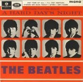
A HARD DAY'S NIGHT: Craw Modern was designed in 1958, so it was available when album produced. Good match for weight. Almost the right width. Leg on _R_ not identical.
Don
Don
Suggested font: Craw Modern
or http://myfonts.us/td-cGUgUX
Edited 2 times. Last edit on May 26, 2015 at 14:21 by drf
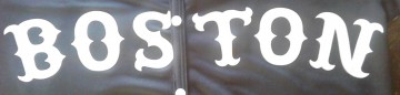
Identified font: Engravers Old English
Edited 2 times. Last edit on May 26, 2015 at 14:21 by drf


Identified font: Rosewood
Edited on May 26, 2015 at 14:30 by drf

Perhaps a modification of Apple's Textile
Don
Edited on May 26, 2015 at 11:54 by drf
Don
Suggested font: Textile
Edited on May 26, 2015 at 11:54 by drf
All times are CEST. The time is now 17:13
