
Forum
3,821 posts Identified fonts
Posts by donshottype

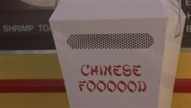
Now politically incorrect, this style originated in a 19th century font called Chinese Wong.
Digital versions abound under various names.
Mandarin looks like a match.
Don
Edited 2 times. Last edit on Jun 21, 2015 at 21:01 by donshottype
Digital versions abound under various names.
Mandarin looks like a match.
Don
Identified font: Mandarin
Edited 2 times. Last edit on Jun 21, 2015 at 21:01 by donshottype
The diabolical pointed lettering as seen in _p_ is based on a 19th century series of fonts variously known as Lafayette, Johnsonian, Webster, Washington etc. http://forums.typeheritage.com/topic/lafayette/
Should be some digital versions published. Dan X. Solo included Lafayette in one of his Dover Publications alphabet books, cira 1998.
The triangle serifs are "Latin" as in Latin CT. Not identical but similar.
Don
Edited 2 times. Last edit on Jun 21, 2015 at 20:51 by donshottype
Should be some digital versions published. Dan X. Solo included Lafayette in one of his Dover Publications alphabet books, cira 1998.
The triangle serifs are "Latin" as in Latin CT. Not identical but similar.
Don
Suggested font: Latin CT
Edited 2 times. Last edit on Jun 21, 2015 at 20:51 by donshottype
I agree with Champion Gothic.
Use the Bantamweight. 100% match.
Don
Use the Bantamweight. 100% match.
Don
Interesting comment on typefaces that influenced the Beverly Hills Hotel signage, by Allan Haley in 2013:
---- start quote ----
In 1940, a new wing was added to the hotel by architect Paul Williams, who was reportedly also responsible for the now legendary signage. While based on hand lettering rather than a typeface design, the script is indicative of typefaces drawn in the 1930s and 1940s. You only need to look to the Coronet, Gillies Gothic or Park Avenue typefaces (all designed in the 1930s) to see the heritage of the Beverly Hills Hotel lettering. Tall sweeping ascenders that serve as elegant counterpoints to the designs diminutive x-heights mark each typeface. Generously flowing capital letters also add to the stylish and expansive nature of the designs. - See more at: http://www.monotype.com/blog/typography-and-cities-beverly-hills
---- end quote ----
Don

Custom, apparently by France HQ and agency Saguez & Partners. But nothing on the current website http://www.saguez-and-partners.com/home
Similar but not identical, Helvetiquette Bold.
Also similar, Gotham.
Don
Similar but not identical, Helvetiquette Bold.
Also similar, Gotham.
Don
Suggested font: Helvetiquette Bold
Corrected Post -- original version had wrong link.
My post dealt with the word _Neilson_.
The new logo runs the letters together and attempts to make them into a script, a poor idea for blackletter.
I prefer the soft version that came before this one.
See https://www.myfonts.com/WhatTheFont/forum/case/327723/
Don
Edited on Jun 21, 2015 at 23:39 by donshottype
Your image is apparently derived from the outside sign http://www.myfonts.com/WhatTheFont/forum/case/476562/
Compare to to the lettering as used in a letterhead or card http://www.myfonts.com/WhatTheFont/forum/case/52359/
Has a few additional letters.
Don
Compare to to the lettering as used in a letterhead or card http://www.myfonts.com/WhatTheFont/forum/case/52359/
Has a few additional letters.
Don

Custom lettering, monoline with an Art Deco style.
Far from a match to the letterforms, but for a similar tone you might substitute something like Grand Hotel.
Don
Far from a match to the letterforms, but for a similar tone you might substitute something like Grand Hotel.
Don
Suggested font: Grand Hotel
_Neilson_ is a softened version of the old logo used by this Canadian Dairy, as shown in an ad from 1923 https://www.pinterest.com/pin/86201780339898105/
With some heavy editing, Old English could be used to create either logo.
Don
With some heavy editing, Old English could be used to create either logo.
Don
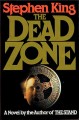
Small scale makes it impossible to identify details but the letters have some similarity to compressed/condensed Latin fonts.
Could get a rough approximation if Sheepman was compressed horizontally.
But there differences, such as the rounded bowls on _P_ and _R_
Don
Edited on Jun 18, 2015 at 17:02 by donshottype
Could get a rough approximation if Sheepman was compressed horizontally.
But there differences, such as the rounded bowls on _P_ and _R_
Don
Suggested font: Sheepman
Edited on Jun 18, 2015 at 17:02 by donshottype

Seems to be custom lettering perhaps based on editing ITC Pump Light. Close the gaps etc.
Don
Don
Suggested font: Pump Light
You already have it if your computer uses Windows and/or MS Office.
Don
Don

Lettering. Note variation in repeating letters.
Don
Don


_ARAWNG_ is a bold Clarendon.
Some further digging might produce a closer match, but Clarendon Text Bold would work in a pinch.
Don
Some further digging might produce a closer match, but Clarendon Text Bold would work in a pinch.
Don
Suggested font: Clarendon Text
Perhaps not a font as such. Uppen Arms NF could be modified to make the logotype.
Don
Don
Suggested font: Uppen Arms NF

All times are CEST. The time is now 21:24
