
Forum
3,821 posts Identified fonts
Posts by donshottype


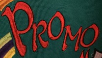
Lettering, not a specific font.
However its in the same general class as Quentin
Don
However its in the same general class as Quentin
Don
Suggested font: Quentin
Lettering, not a specific font.
However its in the same general class as URW Woodtype
Don
However its in the same general class as URW Woodtype
Don
Suggested font: Wood Type
Lettering, not a specific font.
However its in the same general class as Saloon Girl
Don
Edited on Jul 22, 2015 at 08:38 by donshottype
However its in the same general class as Saloon Girl
Don
Suggested font: Saloon Girl
Edited on Jul 22, 2015 at 08:38 by donshottype

Identified font: Ed Interlock

Another font with "organic tentdrils" in its alternates that could be a source for your project.
Don
Don
Suggested font: Virgin
Probably not a font.
However if you want to make something similar you try adapting a font with some similar swash features, you might try Phaeton
Don
However if you want to make something similar you try adapting a font with some similar swash features, you might try Phaeton
Don
Suggested font: Phaeton
This is Tarragon, designed by Alan Meeks for Letraset as a dry transfer sheet font in 1981 and later digitized under that name. The Letraset design was also the basis for unofficial copies including Menuetto
Don
Edited 2 times. Last edit on Jul 21, 2015 at 14:07 by donshottype
Don
Suggested font: Tarragon
Edited 2 times. Last edit on Jul 21, 2015 at 14:07 by donshottype

With adjustments for weight and width
Seems to be based on the same sign makers letters as Featured Item.
Don
Seems to be based on the same sign makers letters as Featured Item.
Don
Suggested font: Entitled
Originally called Label (Filmotype) VGC A-88.
Don
Don

Suggested font: Khedive

Good find.
The full alphabet and numbers are easy to find with a google search for "fonts real madrid jersey"
Don
The full alphabet and numbers are easy to find with a google search for "fonts real madrid jersey"
Don
No need to edit Macbeth, when the Disney people did the job and Callaghn & Kronos made the result into a digital font.
I agree that Ravenscroft is the best match so far for the image.
It's lighter but can be made closer by the parallel line trick.
Don
Edited on Jul 20, 2015 at 18:27 by donshottype
I agree that Ravenscroft is the best match so far for the image.
It's lighter but can be made closer by the parallel line trick.
Don
Edited on Jul 20, 2015 at 18:27 by donshottype

The angled cross stroke on the _R_ was a style feature on some back to basics lettering and fonts shortly after 1900. A good example is Teutonia by Roos & Junge (Offenbach am Main, Germany). Digitized as Teutonia by HiH
Don
Don
Suggested font: Teutonia

The Macbeth design is a modified version of a 19th century font called Rubens.
Rubens is not as good a match to the letter-forms in your image but the proportions are closer.
Don
Rubens is not as good a match to the letter-forms in your image but the proportions are closer.
Don
Suggested font: Rubens
Modified Macbeth -- lighter, narrower
Hint: Try putting a parallel line inside MacBeth.
Don
Edited on Jul 20, 2015 at 10:05 by donshottype
Hint: Try putting a parallel line inside MacBeth.
Don
Suggested font: Macbeth
Edited on Jul 20, 2015 at 10:05 by donshottype

A condensed Clarendon, such as Consort.
Further condense Consort Bold Condensed and there is a match.
Don
Further condense Consort Bold Condensed and there is a match.
Don
Suggested font: Consort Bold Condensed

All times are CEST. The time is now 23:11
