
Forum
3,821 posts Identified fonts
Posts by donshottype


Plain Black Wide by Paul Lloyd
Don
Edited on Aug 27, 2015 at 23:30 by donshottype
Don
Suggested font: Black family
Edited on Aug 27, 2015 at 23:30 by donshottype

With editing to make the _C_ and _M_ relatively larger than the other letters in this unicase blackletter
Don
Don
Suggested font: Libra

Can be generally replicated by using Kunstlerschreibschrift
Make it a little thicker.
Edit _G_ by clipping the initial swash and replacing the bottom stroke with one like the one found on _B_
Don
Edited on Aug 29, 2015 at 10:53 by donshottype
Make it a little thicker.
Edit _G_ by clipping the initial swash and replacing the bottom stroke with one like the one found on _B_
Don
Suggested font: Kunstlerschreibschrift
Edited on Aug 29, 2015 at 10:53 by donshottype


Suggested font: Helvetica Black

Campanile, a font patented by William W. Jackson as D11161 on April 15, 1879 and sold by MacKellar Smith's Jordan, and later by other foundries, under that name.
Dan X. Solo made a digital version, 1998, in the CD sold with the Dover book Victorian Display Fonts. Other independent digitizationas are by Aridi, as Aridi 70., and by Walden as Jugend. There is also an OPTI version which MAY be original, and a version by Deiter Steffmann which is most likely a rip of one of the other versions. As for Campanile from Aridi, http://www.aridi.com/images/fonts/70.gif for a display. It's not clear to me if you can purchase it separately from a big bundle. No other legitimate digital links in my opinion.
Don
Identified font: Campanile

Not certain if this sign is a direct rendering of a font but Cloister URW Heavy is close
Don
Don
Suggested font: Cloister Heavy Weight

Identified font: Helvetica

I agree this script is lettering. Note that the size of the letters gets smaller as you move from left to right.
This style of script is usually called Baseball Script.
You can choose various substitutes that include the swoosh tail under the word. Here is an example from MVB Mascot

Don
This style of script is usually called Baseball Script.
You can choose various substitutes that include the swoosh tail under the word. Here is an example from MVB Mascot
Don
Suggested font: MVB Mascot

If this is a font it has been edited to make the letters progressively smaller -- which provides a perspective effect -- and perhaps to tilt at least the _P_ and _A_ leftwards.
One option is to use Startling and expand the width 150%

Then change the relative sizes and do the tilts.
BTW Startling is based on the title for a pulp science fiction magazine called _Startling Stories_ published from 1939 to 1955.
Don
Edited on Aug 26, 2015 at 13:35 by donshottype
One option is to use Startling and expand the width 150%
Then change the relative sizes and do the tilts.
BTW Startling is based on the title for a pulp science fiction magazine called _Startling Stories_ published from 1939 to 1955.
Don
Suggested font: Startling
Edited on Aug 26, 2015 at 13:35 by donshottype
Created by Karl-Erik Forsberg
Perhaps developed from Volta, according to http://www.logodesignlove.com/volvo-logo
Don
Perhaps developed from Volta, according to http://www.logodesignlove.com/volvo-logo
Don
Suggested font: Volta Bold
Yes, and perhaps a few others.
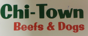
Both fonts were based on the same Filmotype source, but Jason Walcott used it as an "inspiration" for Golden State -- the font used in the _Chi-Town Beefs & Dogs_ image while Filmotype Melody is a digital recreation of the 1950s font.
For an exact reproduction of all letters of _Chi-Town Beefs & Dogs_, Golden State is needed.
Don
For a less expensive version of this phototype era Free-Style typeface -- but note the different ampersand -- you can use Filmotype Melody
Don
Don
Suggested font: Filmotype Melody

Also: http://www.fontsquirrel.com/fonts/lobster-two
Edited on Aug 25, 2015 at 17:09 by drf
Identified font: Lobster
Edited on Aug 25, 2015 at 17:09 by drf

I believe _Gilgamesh_ has its roots in Times Roman.
I don't know if it was made into a special font for these letters or whether they were custom made for the the word.
Compare the word to:

which was made by compressing Times Ten Roman Bold to 45%.
Open the bottom counter on _g_, round the dot on _i_ and it is pretty close to your image.
The lower phase is too small to identify with any certainty.
Edited on Aug 25, 2015 at 15:24 by donshottype
I don't know if it was made into a special font for these letters or whether they were custom made for the the word.
Compare the word to:
which was made by compressing Times Ten Roman Bold to 45%.
Open the bottom counter on _g_, round the dot on _i_ and it is pretty close to your image.
The lower phase is too small to identify with any certainty.
Suggested font: Times Ten Bold
Edited on Aug 25, 2015 at 15:24 by donshottype

Suggested font: Old English
Better quality image of Absolut Headline

Don
Don

Futura [already suggested] is fairly close to Absolute Headline.
Compare the specimen I posted to Futura Condensed Extra Bold
Don
Edited on Aug 25, 2015 at 00:52 by donshottype
Compare the specimen I posted to Futura Condensed Extra Bold
Don
Suggested font: Futura Condensed ExtraBold (Already suggested here)
Edited on Aug 25, 2015 at 00:52 by donshottype
All times are CEST. The time is now 21:52
