
Forum
3,821 posts Identified fonts
Posts by donshottype


Bits and pieces of the letters remind me Herman Ihlenberg's Columbian of 1891.
None of the digital versions are first class recreations of the design.
For an extensive discussion of the assorted hack jobs and clones see http://www.dafont.com/fr/forum/read/183206/font-rip-offs
P22 Victorian Swash is an average rendition of Columbian.
Don
None of the digital versions are first class recreations of the design.
For an extensive discussion of the assorted hack jobs and clones see http://www.dafont.com/fr/forum/read/183206/font-rip-offs
P22 Victorian Swash is an average rendition of Columbian.
Don
Suggested font: Victorian Swash
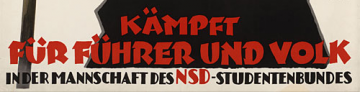
This heavy lettering style was popular in Germany for a decade before the Nazi era. They used it because they wished to appeal to current tastes.
A little bit of the flavor of this style is found in Bremen Black which is based on this genre of poster lettering,
A little bit of the flavor of this style is found in Bremen Black which is based on this genre of poster lettering,
Suggested font: Bremen Black
The second screen shot confirms that the studio that made this movie uses the font for both of the pictures that it made.
Google linked to various sites, but none had more specimens.
I have kept my eyes open for any possible matches but so far nothing.
I suppose that at this stage your best hope for more info on the font would be to contact the studio.
Don
Google linked to various sites, but none had more specimens.
I have kept my eyes open for any possible matches but so far nothing.

I suppose that at this stage your best hope for more info on the font would be to contact the studio.
Don
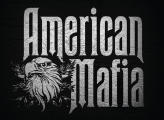
Agree it is Ravenscroft. Note that the _n_ is edited to match _m_
The Disney sign-makers derived their design from a 19th century font called Rubens.
Compare Ravenscroft to Rubens as shown at http://www.myfonts.com/fonts/woodentypefonts/rubens/
Rubens has the drop leg _n_ but is wider than _American Mafia_
Don
Edited on Sep 10, 2015 at 10:16 by drf
The Disney sign-makers derived their design from a 19th century font called Rubens.
Compare Ravenscroft to Rubens as shown at http://www.myfonts.com/fonts/woodentypefonts/rubens/
Rubens has the drop leg _n_ but is wider than _American Mafia_
Don
Suggested font: Rubens
Edited on Sep 10, 2015 at 10:16 by drf


Logo, seems to have been an attempt to produce a rounded soft blackletter derived from a font like Fette Gotisch
Don
Don
Suggested font: Fette Gotisch
BTW the Campanile by Deiter Steffmann seems to be a rip of the digital outlines created by Aridi. Mr. Steffmann's practice, which he mentioned many years ago, was to add characters and accents to existing digitizations of fonts that he felt were not widely available and to "share" the result.
Unfortunately the only way to legitimately acquire the Aridi Campanille is by the purchase of an expensive vector package.
http://www.aridi.com/images/fonts/70.gif
The Aridi people seem to have ignored modern marketing
Don
Unfortunately the only way to legitimately acquire the Aridi Campanille is by the purchase of an expensive vector package.
http://www.aridi.com/images/fonts/70.gif
The Aridi people seem to have ignored modern marketing

Don
Looks like someone has edited the following letters from Campanile

Perhaps to make a new font, perhaps as a logo
Campanile is a 19th century font.
Legitimate versions include the one by Dan X. Solo that came with that came on a CD with his book of Victorian typefaces published by Dover.
Lots of rip versions on the web, taken from the Solo version and from an Aridi scan. I do not link to ripped fonts.
Don
Edited 2 times. Last edit on Sep 09, 2015 at 11:06 by drf
Perhaps to make a new font, perhaps as a logo
Campanile is a 19th century font.
Legitimate versions include the one by Dan X. Solo that came with that came on a CD with his book of Victorian typefaces published by Dover.
Lots of rip versions on the web, taken from the Solo version and from an Aridi scan. I do not link to ripped fonts.
Don
Suggested font: Campanile
Edited 2 times. Last edit on Sep 09, 2015 at 11:06 by drf

Saloon Girl with the same editing as for Wood Type URW
Don
Edited on Sep 08, 2015 at 10:01 by donshottype
Don
Suggested font: Saloon Girl
Edited on Sep 08, 2015 at 10:01 by donshottype
Wood Type URW with minor editing
Don
Edited on Sep 08, 2015 at 10:01 by donshottype
Don
Suggested font: Wood Type
Edited on Sep 08, 2015 at 10:01 by donshottype
I cleaned up your image

It is now clear to me that none of my suggestions were close enough to substitute, as they lack the distinctive notches in the strokes.
Do you have any more screen grabs?
Do you know the name of the movie?
Don
It is now clear to me that none of my suggestions were close enough to substitute, as they lack the distinctive notches in the strokes.
Do you have any more screen grabs?
Do you know the name of the movie?
Don
Larger pic?
Don
Don

Reminds me of an automobile license plate.
Small scale of image so it is not clear wheter the corders are rounded, sharp or chamfered.
If the corners are rounded, try Driver Gothic
Don
Small scale of image so it is not clear wheter the corders are rounded, sharp or chamfered.
If the corners are rounded, try Driver Gothic
Don
Suggested font: Driver Gothic

This version of Avant Garde Gothic seems to include the unicase glyphs
Don
Don
Identified font: Avant Garde Gothic Book
Edited:
Looks like a unicase version of Avant Garde Gothic, which I did not spot as a font.
Kravitz is a unicase font with the same choices but some of the letter shapes are different
Don
Edited 2 times. Last edit on Sep 07, 2015 at 06:36 by donshottype
Looks like a unicase version of Avant Garde Gothic, which I did not spot as a font.
Kravitz is a unicase font with the same choices but some of the letter shapes are different
Don
Suggested font: Kravitz
Edited 2 times. Last edit on Sep 07, 2015 at 06:36 by donshottype

Suggested font: Lobster Two

Suggested font: Letter Gothic
All times are CEST. The time is now 11:43
