
Forum
3,821 posts Identified fonts
Posts by donshottype

Good find. 
This is the earlier version of Sharkshock's Republica Minor and has an _a_ which matches the image.
Don
Edited 2 times. Last edit on Oct 05, 2015 at 16:19 by donshottype

This is the earlier version of Sharkshock's Republica Minor and has an _a_ which matches the image.
Don
Edited 2 times. Last edit on Oct 05, 2015 at 16:19 by donshottype
Looks like the 1999 reconstruction of the 1978 sign at Jonestown, Guyana above the throne of suicide cult leader Jim Jones.
Would have been hand lettered and perhaps not based on any specific font.
The unusual _M_ is similar to Chesterfield
Don
Edited on Oct 05, 2015 at 17:01 by drf
Would have been hand lettered and perhaps not based on any specific font.
The unusual _M_ is similar to Chesterfield
Don
Suggested font: Chesterfield
Edited on Oct 05, 2015 at 17:01 by drf
Identified font: Campton Medium
UCL font for Real Madrid 2015-16
Football club font, not available to public
Don
Football club font, not available to public
Don
Suggested font: Real Madrid 2015-16


Wonderful bloated swooshy lettering that says early 1970s.
Candice has the vibe -- but not a match.
Don
Candice has the vibe -- but not a match.
Don
Suggested font: Candice
Can we even begin to count how many fonts have been "inspired" by Futura Condensed Bold?
Don
Don

Identified font: Futura Bold
Edited 2 times. Last edit on Oct 05, 2015 at 04:09 by jerseygirl
I remember those.
Differences were trivial.
Don
Differences were trivial.
Don
Interesting -- Airport presumably was futuristic?
I can't spot any differences from Futura bold cond. Did I miss something?
Monotype seems to have been no slouch in the clone and rename game.
Don
I can't spot any differences from Futura bold cond. Did I miss something?
Monotype seems to have been no slouch in the clone and rename game.
Don
At the risk of launching an endless discussion I'll say my 2 cents worth.
I find that we are all served poorly when the US corporate giants use IP as a way of browbeating the world. T, Roosevelt said The US should carry big stick. Those of us on the receiving end are not so happy.
The Trans-Pacific Trade Agreement -- that may be announced today -- or further postponed, includes oppressive IP obligations that must be met by other countries. From the owners of Micky Mouse to the pharmaceutical cartel that denies access to generic drugs until many years have passed. Indeed, it stinks
Don
Edited 2 times. Last edit on Oct 05, 2015 at 01:14 by donshottype
I find that we are all served poorly when the US corporate giants use IP as a way of browbeating the world. T, Roosevelt said The US should carry big stick. Those of us on the receiving end are not so happy.
The Trans-Pacific Trade Agreement -- that may be announced today -- or further postponed, includes oppressive IP obligations that must be met by other countries. From the owners of Micky Mouse to the pharmaceutical cartel that denies access to generic drugs until many years have passed. Indeed, it stinks

Don
Edited 2 times. Last edit on Oct 05, 2015 at 01:14 by donshottype
...ooooh, snakes writhing 
Just the thing for aspiring witches.
Don

Just the thing for aspiring witches.
Don

This is the pre-digital Vendome, designed by François Ganeau in 1952.
Unique letters, such as _G_.
Several digital versions, one of which might include the swash tailed _Q_ as an alt.
Worth checking.
Don
Unique letters, such as _G_.
Several digital versions, one of which might include the swash tailed _Q_ as an alt.
Worth checking.
Don
Suggested font: Vendome
Not 100% but close enough to use as a substitute without editing, except for _a_ which is different.
Can get closer by editing Compacta Black
So you have a choice, Republica as is for a 90% plus match or Compacta Black with editing for a closer match.
Don
Can get closer by editing Compacta Black
So you have a choice, Republica as is for a 90% plus match or Compacta Black with editing for a closer match.
Don
Agree could be made from Compacta Black. If you slope _a_, _e_ and _n_ they seem to match. Use sloped _o_ to make _b_ and _d_.
Don
Don

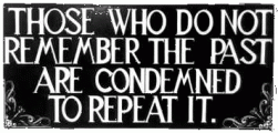
Sign, so nothing identical.
Closest match for a spurred Roman is Old Tom Spurred. Little editing needed to approximate the sign, except for _G_ and _A_.
Don
Closest match for a spurred Roman is Old Tom Spurred. Little editing needed to approximate the sign, except for _G_ and _A_.
Don
Suggested font: Old Tom Spurred
Same font
Don
Don

Another similar font
Don
Edited on Oct 03, 2015 at 22:57 by donshottype
Don
Suggested font: Eckhardt Speedletter
Edited on Oct 03, 2015 at 22:57 by donshottype
NBC television 1952 to 1961
Some similarity to Flash by Edwin W. Shaar, 1939
Don
Some similarity to Flash by Edwin W. Shaar, 1939
Don
Suggested font: Flash Bold
Different _N_
Don
Edited on Oct 05, 2015 at 10:09 by drf
Don
Edited on Oct 05, 2015 at 10:09 by drf
All times are CEST. The time is now 22:57
