
Forum
13,568 posts Identified fonts Requests only
Posts by Heron2001


Identified font: Milestone

Identified font: Foreplay


I am not quite sure what you are looking for, but if you want to retype DESPlCABLE ME (using a lowercase L instead of an uppercase I) to have a squared look, try this.
Suggested font: Tablet Gothic ExtraBold

Identified font: Painting With Chocolate

Take a look at Isabel Semi Condensed Boldbut not as zero onebut as a capital O and a 1.
Suggested font: Isabel Semi Condensed Bold

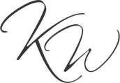
I don't know which manufacturer did this one, because the crotch of the W is a little off.
Suggested font: Scriptina

Identified font: Peaches For Breakfast

Korean DS Handel for 성남시
Suggested font: Handel


There is a font named CK Racer (but I cannot find a legit link). This looks like itbut someone stepped on it... if not a match, it comes close.
Suggested font: CK Racer

Identified font: Cambridge

See the alternatives here: https://www.myfonts.com/collections/bookman-font-itc?tab=glyphs
Edited on Aug 09, 2024 at 03:49 by frd
Identified font: Bookman Italic
Edited on Aug 09, 2024 at 03:49 by frd
Isn't this from The Little Prince? If so, it is not a font.
Elisandro Valentino 18 said 
Bump
Please take a look at the weights in https://www.myfonts.com/collections/mina-font-resistenza
and type out not only the peak but make sure to type No -- you'll see it matches.

Identified font: Tenderness
Identified font: Serpentine Bold
All times are CEST. The time is now 18:06
