
Forum
3,821 posts Identified fonts
Posts by donshottype


Art Nouveau lettering as an interpretation of classic Roman capitals.
Deserves to be made into a digital font.
Baylac offers a similar treatment but with tiny serifs instead of the bulbous ones in the image.
Don
Deserves to be made into a digital font.
Baylac offers a similar treatment but with tiny serifs instead of the bulbous ones in the image.
Don
Suggested font: Baylac

Identified font: University Roman

Line up the letters

and it looks like lettering.
You might be able to do something with Castle Ultra.
There might be a Cyrillic version somewhere.
Don
Edited on Oct 27, 2015 at 09:19 by donshottype
and it looks like lettering.
You might be able to do something with Castle Ultra.
There might be a Cyrillic version somewhere.
Don
Suggested font: Castle Ultra
Edited on Oct 27, 2015 at 09:19 by donshottype

Also some echo of Bauer's Futura display, with various digital versions
Don
Don
Suggested font: Futura Display
Perhaps custom lettering.
Has a heavy narrow boxy 1940s flavor, similar to a font like Handmade Gothic JNL
Don
Has a heavy narrow boxy 1940s flavor, similar to a font like Handmade Gothic JNL
Don
Suggested font: Handmade Gothic

Suggested font: Cabazon
Digital version available from website of Dr. Helzel http://www.fraktur.biz/
Have to dig though his pages to find it.
Good quality fonts, available only at his website.
People reported being satisfied with direct purchase from him.
Don
Edited on Oct 27, 2015 at 00:33 by donshottype
Have to dig though his pages to find it.
Good quality fonts, available only at his website.
People reported being satisfied with direct purchase from him.
Don
Edited on Oct 27, 2015 at 00:33 by donshottype
Looks like "Element" a "jackboot" blackletter designed in 1929.

Update: I forgot to include the _Y_. It's also a match.
Don
Edited 2 times. Last edit on Oct 27, 2015 at 00:35 by donshottype
Update: I forgot to include the _Y_.
 It's also a match.
 Don
Suggested font: Element
Edited 2 times. Last edit on Oct 27, 2015 at 00:35 by donshottype
Identified font: Stop

Suggested font: Sarah Script
Suggested font: TheNautiGal
Can't say for certain whether this is a font using ligatures for the _oo_, terminal forms for the _e_ etc. or hand lettering.
Some of the vibe is captured in Alpine Script, which has rather different letterforms.
Don
Some of the vibe is captured in Alpine Script, which has rather different letterforms.
Don
Suggested font: Alpine Script

Custom lettering for _Saddleworld_. Here is a higher resolution image:

Closest font is perhaps Hemihead, which has gaps and various differences. An inverted and mirrored _m_ looks somewhat similar to the _w_ in _Saddleworld_.
A weight to match can be found on MyFonts at http://myfonts.us/td-iZM82w
Don
Edited 3 times. Last edit on Oct 26, 2015 at 10:20 by donshottype
Closest font is perhaps Hemihead, which has gaps and various differences. An inverted and mirrored _m_ looks somewhat similar to the _w_ in _Saddleworld_.
A weight to match can be found on MyFonts at http://myfonts.us/td-iZM82w
Don
Identified font: Hemi Head
Edited 3 times. Last edit on Oct 26, 2015 at 10:20 by donshottype

Inconsolata Bold has a much closer _G_

It could be used to recreate the logo if compressed horizontally, thickened and with minor modification of the upper terminal
Don
It could be used to recreate the logo if compressed horizontally, thickened and with minor modification of the upper terminal
Don
Suggested font: Inconsolata Bold
It would seem that Daniel Pelavin's Anna is the original. Identifont says he produced Anna in 1991. Showtime and Real Virtue are 1996 and/or 1998.
Don
Don
The most distinctive letter is the _G_ -- the _E_ is a simple modification of many fonts.
The bottom half of the _G_ is similar to to fonts such as Neue Frutiger Condensed Heavy for the white fill and Neue Frutiger Condensed Black for the outline. Condense them further and combine with a segment from _O_ for the top and you can produce something similar.
Don
Edited 2 times. Last edit on Oct 23, 2015 at 17:03 by drf
The bottom half of the _G_ is similar to to fonts such as Neue Frutiger Condensed Heavy for the white fill and Neue Frutiger Condensed Black for the outline. Condense them further and combine with a segment from _O_ for the top and you can produce something similar.
Don
Suggested font: Neue Frutiger Condensed Heavy
Edited 2 times. Last edit on Oct 23, 2015 at 17:03 by drf


The heavier weight that matches your image is available at MyFonts.com https://www.myfonts.com/fonts/typodermic/hemi-head/
Looks like there is also some manual thickening.
Don
Edited 2 times. Last edit on Oct 23, 2015 at 14:59 by donshottype
Looks like there is also some manual thickening.
Don
Identified font: Hemi Head
Edited 2 times. Last edit on Oct 23, 2015 at 14:59 by donshottype

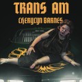
Identified font: Artistik
All times are CEST. The time is now 04:04
