
Forum
3,821 posts Identified fonts
Posts by donshottype

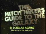
Top line is Mr. Eaves Modern Bold, manually expanded 120 percent
Bottom line, with the same height, is Mr. Eaves Modern Heavy, manually expanded 120 percent

Neither is a 100 percent match, but a blend of the two weights would be closer.
Perhaps also need to expand the width by something rather more than 120 percent.
Don
Edited on Nov 04, 2015 at 20:26 by donshottype
Bottom line, with the same height, is Mr. Eaves Modern Heavy, manually expanded 120 percent
Neither is a 100 percent match, but a blend of the two weights would be closer.
Perhaps also need to expand the width by something rather more than 120 percent.
Don
Edited on Nov 04, 2015 at 20:26 by donshottype
I suspect this is custom not a straightforward application of a standard font.
Comments on suggested fonts:
Adrianna Extended ExtraBold/Bold has different terminals on _C_ -- angled not vertical -- and other differences.
Mr Eaves Modern Heavy is too narrow.
Suggestion: Try manually expanding the width of Mr. Eaves Modern Bold. The result might work as an approximation.
Don
Comments on suggested fonts:
Adrianna Extended ExtraBold/Bold has different terminals on _C_ -- angled not vertical -- and other differences.
Mr Eaves Modern Heavy is too narrow.
Suggestion: Try manually expanding the width of Mr. Eaves Modern Bold. The result might work as an approximation.
Don

Morris Fuller Benton design from 1905 sold by American Type Founders as Typo Upright
Don
Don
Identified font: Linoscript

Might not have made the transition to digital type.
The bottom half is similar to Teutonic
Don
The bottom half is similar to Teutonic
Don
Suggested font: Teutonic
Identified font: Futura Bold

Custom lettering for a beer company. 
Several versions.
High resolution image of a more polished one than shown in your image.

Don
Edited 2 times. Last edit on Nov 03, 2015 at 12:08 by donshottype

Several versions.
High resolution image of a more polished one than shown in your image.
Don
Edited 2 times. Last edit on Nov 03, 2015 at 12:08 by donshottype
Identified font: Black Castle

_COCOON OF DESTRUCTION_ Charcuterie Block Bold with additional distressing
Don
Don
Identified font: Charcuterie Block Bold

Custom lettered logo for major global company http://www.schwing.de/en/company/global-presence/
Closest font is perhaps Tondu. The _S_ of _SCHWING_ looks similar to a mirrored _Z_ of Tondu with rounded tips.
Don
Closest font is perhaps Tondu. The _S_ of _SCHWING_ looks similar to a mirrored _Z_ of Tondu with rounded tips.
Don
Suggested font: Tondu
Suggested font: Eurostile

Some similarity to Carbon by Typodermic Fonts
Don
Edited on Nov 03, 2015 at 15:07 by drf
Don
Suggested font: Carbon
Edited on Nov 03, 2015 at 15:07 by drf
I voted to agree with Xtreem, but note that the _S_ is Different
Don
Edited on Nov 03, 2015 at 15:05 by drf
Don
Edited on Nov 03, 2015 at 15:05 by drf


Suggested font: Old English
Good find 

No need to make it from scratch
Don

No need to make it from scratch
Don

Looks like custom lettering or a heavily modified font -- the scale is too small to make a 100% identification.
The _A_ can be replicated using the strokes in some of the swash letters included with Vulpa Italic

Flip the _V_ upside down and combine the rhs with the lhs of the swash _A_. Mirror the _V_ pick up the swash tail to use as the top serif. Adjust sizes and shapes. And voilà the cute _A_.
BTW, Vulpa is far from a match and the link is included only to provide ready access to Vulpa Italic
Don
The _A_ can be replicated using the strokes in some of the swash letters included with Vulpa Italic
Flip the _V_ upside down and combine the rhs with the lhs of the swash _A_. Mirror the _V_ pick up the swash tail to use as the top serif. Adjust sizes and shapes. And voilà the cute _A_.

BTW, Vulpa is far from a match and the link is included only to provide ready access to Vulpa Italic
Don
Suggested font: Vulpa

All times are CEST. The time is now 12:17
