
Forum
3,821 posts Identified fonts
Posts by donshottype


With the serif cut off the top of _E_ and _T_
An inexpensive version of Dynamo
An inexpensive version of Dynamo
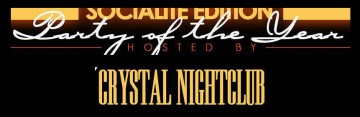
Suggested font: Elektromoto


Edited to extend the connecting stroke between _e_ and _C_ and to add a connecting stroke between _s_ and _a_ as well as some other minor tweeks.
Suggested font: Script
Edition is a match, with letters made thicker by a parallel stroke with this result:

Good find 
Daniel Zadorozny is a wonderful source for digital versions of old time fonts -- which he slips in among his vast assortment of sci-fi and techno creations.
Edited 3 times. Last edit on Jan 28, 2016 at 10:07 by drf

Daniel Zadorozny is a wonderful source for digital versions of old time fonts -- which he slips in among his vast assortment of sci-fi and techno creations.
Edited 3 times. Last edit on Jan 28, 2016 at 10:07 by drf
Perhaps a font from before the digital era?

Suggested font: Filmotype Hudson


Top portion _Est.1894 Kellers Restaurant. LLC_ looks like Playbill made bolder by a parallel stroke.
Edited on Jan 27, 2016 at 12:39 by donshottype
Suggested font: Playbill
Edited on Jan 27, 2016 at 12:39 by donshottype

Identified font: Brothers

Identified font: Candice

Suggested font: Americana

Some similarities to Shelley Script, but there are differences -- most notably the _r_ with the little loop on top.
I wonder if it is a font or a customization?
I wonder if it is a font or a customization?

Suggested font: Shelley Script

Identified font: Arnold Boecklin

Identified font: Mistral
All times are CEST. The time is now 07:36
