
Forum
13,582 posts Identified fonts Requests only
Posts by Heron2001


This is based on Bookman with Swash - closest I can find in today's font market is this
Suggested font: Bookman


Identified font: Hendangan

it looks like Clarendon made by a manufacturer who changed a few things... and then heavied up the bold.
Suggested font: Clarendon

Identified font: Quotable

It looks like a modified version of Quantify
Edited on Sep 24, 2020 at 08:53 by frd
Suggested font: Quantify
Edited on Sep 24, 2020 at 08:53 by frd


Identified font: ChunkFive Ex

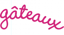
This was probably hand-tailored to make a logo. You could come close modifying Zeppelin 41
NOT THE FONT
NOT THE FONT
Suggested font: Zeppelin


Identified font: Mont


some manufacturers use to make alternatives - like fr the letters C and E. This was probably an old typositor font. Closest today would be Washington in Bold weight.
Suggested font: Washington

All times are CEST. The time is now 03:05
