
Forum
3,821 posts Identified fonts
Posts by donshottype

Endless variations from the photo film era -- stretch, squeeze, distort -- exercise class for fonts 

Slow again 


Suggested font: Rockwell ExtraBold (Already suggested here)


Planscribe NF is not Italic, but is based on a lettering device, and is much less expensive than Felth Gothic.
If sloped, it might pass as a rough approximation of your label.
If sloped, it might pass as a rough approximation of your label.
Suggested font: Planscribe
To see a Leroy machine in use go to
http://kleinletters.com/Blog/logo-study-wonder-woman-part-1/
and scroll half way down the page
http://kleinletters.com/Blog/logo-study-wonder-woman-part-1/
and scroll half way down the page
Yes, handcrafted letters using the assistance of a device.
Similar effect using Felth Gothic Italic
Similar effect using Felth Gothic Italic
Suggested font: Felth Gothic Italic

AFAIK no exact match in a font.
Similar: Potrzebie, based on an old phototypesetting font called Animated Latin.
Similar: Potrzebie, based on an old phototypesetting font called Animated Latin.
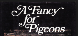
Suggested font: Potrzebie

Identified font: Rosewood

Identified font: Hensler

Suggested font: Balloon

Suggested font: Tondella
Duc de Berry and Tallyrand could be massaged to more or less fit _Ber_, but letters like _a_ are quite different

Suggested font: Duc de Berry

Identified font: Agency

Suggested font: Nemek Gothic

Identified font: Showcard Gothic
All times are CEST. The time is now 18:48
