
Forum
760 posts Identified fonts Requests only
Posts by Chronos


Identified font: Zapfino
Edited on Jul 30, 2014 at 10:18 by drf
Then simply convert it to curves/paths/outlines and do it manually.
At least fix the poor kerning between the E and the R (too tight), and the R and the C (too much).

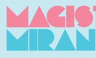
Identified font: Dock 11
Edited on Jul 29, 2014 at 18:01 by drf

Identified font: Colossalis
Edited on Jul 29, 2014 at 17:19 by drf

Identified font: Anglo Saxon Caps
Edited on Jul 29, 2014 at 17:22 by drf


Repeated letters don't match, likely not a font. Calgary Script is similar.
Edited on Jul 27, 2014 at 10:32 by drf
Suggested font: Calgary Script
Edited on Jul 27, 2014 at 10:32 by drf
Why not? Copying happens all the time (Xerox made a fortune out of it). There's no version of bank Gothic that has those.
Edited on Jul 27, 2014 at 05:06 by Chronos
Edited on Jul 27, 2014 at 05:06 by Chronos

There are 3 different fonts shown, please specify which one you're asking about; we're not psychic.
Point!

Suggested font: Albireo
Edited 4 times. Last edit on Jul 27, 2014 at 09:17 by drf

Identified font: Bebas Neue
Edited on Jul 27, 2014 at 10:12 by drf

Suggested font: FS Me
Edited on Jul 27, 2014 at 10:11 by drf
Suggested font: Devandra
Edited on Jul 27, 2014 at 10:01 by drf
Identified font: RNS Bobo Dylan
Edited on Jul 27, 2014 at 09:58 by drf


Identified font: P22 Johnston Underground
Edited on Jul 27, 2014 at 09:54 by drf
Please be more specific.
All times are CEST. The time is now 06:20
