
Forum
393 posts Identified fonts
Posts by conman1985


Suggested font: Spin Cycle
Based on a font used for 1980's Roland music equipment. Also listed by Dan X. Solo in Art Deco Display Alphabets (1982) as Earth.
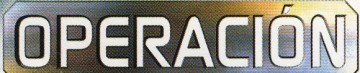
Identified font: Pbio

Compugraphic Zarana (cloned digitally as Watford).
Edited on Oct 01, 2015 at 13:48 by drf
Identified font: Watford
Edited on Oct 01, 2015 at 13:48 by drf

Identified font: Xenotron


Similar alternative could be Compugraphic Zarana (cloned digitally as Watford). If you repair the angled cuts from characters and match the slant it's very close.
Edited on Oct 01, 2015 at 13:40 by drf
Suggested font: Watford
Edited on Oct 01, 2015 at 13:40 by drf

Original typeface known as Compugraphic Max Bold. Digital version by Castcraft Software known as OPTIMirc-Bold.
Edited on Oct 01, 2015 at 13:29 by drf
Suggested font: Mirc Bold
Edited on Oct 01, 2015 at 13:29 by drf
The 'R' is slightly different. As there have been many digital interpretations of Sol, it's possible this slight variance appeared in one of them.
Suggested font: Sol Bold
DIN Next Condensed Heavy is just a bit too heavy.
I think the problem might be that you are viewing the font on a white background which causes the negative space to appear larger than a sample on a black background.

Edited on Aug 13, 2015 at 05:52 by conman1985
I think the problem might be that you are viewing the font on a white background which causes the negative space to appear larger than a sample on a black background.
Edited on Aug 13, 2015 at 05:52 by conman1985

Close to Helvetica Bold Condensed. Seinfeld sample may be using phototype version for optical titles with slight differences.
Edited on Aug 11, 2015 at 07:57 by conman1985
Suggested font: Helvetica Bold Condensed
Edited on Aug 11, 2015 at 07:57 by conman1985
DIN Next Pro Condensed Bold looks to be it. Nice find.

Suggested font: Earth

You might also be able to modify Enter Sansman Bold into something close.

Edited 2 times. Last edit on Aug 07, 2015 at 11:47 by conman1985
Suggested font: Enter Sansman
Edited 2 times. Last edit on Aug 07, 2015 at 11:47 by conman1985
Yes, I realized what they wanted shortly after. I was merely pointing towards Syntax Ultra Black as the original Sonic font in response to the NISE Sonic ID (though I suppose it's easier to use than having to modify Syntax).
However, 'THE HEDGEHOG' text as it appears here looks to be custom logotype with no matching font. Sneakout is similar in style.
Apologies for any confusion.
However, 'THE HEDGEHOG' text as it appears here looks to be custom logotype with no matching font. Sneakout is similar in style.
Apologies for any confusion.
Suggested font: Sneakout

The dot on the 'i' is custom also. Looks as if some weight has been added, though this is possibly due to printing processes.
Suggested font: Helvetica Black

The BATMAN text is set in SpikerSerif by Austin Putnam (Previously at de Beyer/6ix in Los Angeles: www.debeyer6ix.com). No longer officially available.

Slight differences in the B and G on Marianna.
All times are CEST. The time is now 01:08
