
Forum
240 posts Identified fonts Requests only
Posts by WinsorPrint

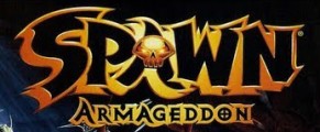
ARMAGEDDON is a modified version of Exocet Heavy merged with the above Spawn font.
Edited on May 02, 2018 at 16:59 by frd
Suggested font: Exocet Heavy
Edited on May 02, 2018 at 16:59 by frd


Suggested font: Enchanted Land
Edited on Apr 15, 2018 at 13:24 by marty666

Here are two free fonts that have the general look for engraved plates...
Edited on Apr 04, 2018 at 13:26 by marty666
Suggested font: Odin Rounded
Edited on Apr 04, 2018 at 13:26 by marty666
Suggested font: Engineering Plot
Edited on Apr 04, 2018 at 13:27 by marty666

The titles are in Lydian Cursive.
Edited 2 times. Last edit on Apr 01, 2018 at 11:09 by marty666
Identified font: Lydian Cursive
Edited 2 times. Last edit on Apr 01, 2018 at 11:09 by marty666
These title cards were all hand lettered back in the 1930s and 40s. The WALT DISNEY lettering is based on Futura Display and MICKEY MOUSE looks to be based on Kabel Black.

It's an altered version of Gillies so that the letters are joined. A free version of this font is called Flottflott.
Suggested font: Flottflott

It looks like a custom hand-lettered font because of the variations in the letters. Varsity is similar if you invert the colours and add a "stripe" to the middle.
Suggested font: Varsity


Not a font, this logo was hand lettered in the 1920s. Closest font is Monogramos by woodcutter.
Suggested font: Monogramos

This one has a strong 1980's script feel to it. The closest thing I can find is Kaufmann.
Edited on Feb 20, 2018 at 11:24 by frd
Suggested font: Kaufmann
Edited on Feb 20, 2018 at 11:24 by frd

Identified font: IFC Rail Road

All times are CEST. The time is now 14:08
