
Forum
13,581 posts Identified fonts Requests only
Posts by Heron2001


Identified font: Adam
Suggested font: Classic Robot


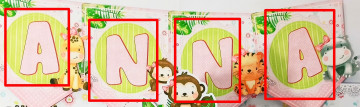
Identified font: Lemonade


Suggested font: Mastermind


Xheighter Condensed Italic - manually stretched out may do the trick.
Suggested font: Xheighter Condensed

Identified font: Futura Extra Bold
Suggested font: Nationalyze

Identified font: Exo 2

Identified font: Hoefler Text
I think because this is signage the person who made it did it by hand. It looks like they grabbed some of the letters (RB) from the Foreign look - Roman/Greek pages and the only time I have seen that O was here on dafont in Chizz. But I would consider marking this "Not a Font."
Identified font: Cheeseburger

Identified font: Playfair Display Bold
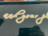
Suggested font: Scriptina


Identified font: Venera
Identified font: Tan-Kindred
All times are CEST. The time is now 02:13
