
Forum
7,041 identified fonts All posts
Identified fonts by marty666


Identified font: Porcelain

Identified font: Dirt2 SoulStalker
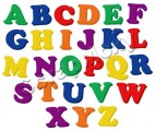
Identified font: Cooper Black

Identified font: Mistral (Roger Excoffon)

je pense que tu te mets dans l'illégalité si tu la trouves et t'en sers...
Identified font: LFP par Eric de Berranger

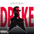
PITTSBURGH :
Impact, a bit rescaled vertically
POWER :
Impact, with a vertical bar on some letters...
the 'r' on Power is different, because they used the "n" of the Impact and cut one of his legs...
and regarding the outline on Power, it's not from the font, it's just a basic stroke made in Photoshop

Impact, a bit rescaled vertically
POWER :
Impact, with a vertical bar on some letters...
the 'r' on Power is different, because they used the "n" of the Impact and cut one of his legs...
and regarding the outline on Power, it's not from the font, it's just a basic stroke made in Photoshop
Identified font: Impact (on your computer)

Identified font: Cooper

Arial Bold (with a negative tracking)
Edited on Sep 13, 2010 at 15:07 by marty666
Identified font: Arial Bold (probably already on your computer)
Edited on Sep 13, 2010 at 15:07 by marty666


for admin, look at this section :
http://www.dafont.com/fr/bitmap.php?page=1&nb_ppp_old=10&text=ADMIN+admin&nb_ppp=50&psize=m&classt=pop
for the background, looks like strangely boldified MadreDeus (by dasklem, from this forum)
http://www.dafont.com/fr/bitmap.php?page=1&nb_ppp_old=10&text=ADMIN+admin&nb_ppp=50&psize=m&classt=pop
for the background, looks like strangely boldified MadreDeus (by dasklem, from this forum)
Identified font: Madredeus


dafont n'est pas un forum pirate...
si la police est une police commerciale, eh bien elle reste une police commerciale.
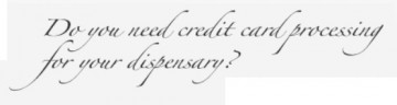
Cette police s'appelle la Forte
si la police est une police commerciale, eh bien elle reste une police commerciale.
Cette police s'appelle la Forte
Identified font: Forte
salut,
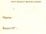
c'est la ITC American Typewriter Bold
Edited on Apr 19, 2010 at 16:40 by marty666
c'est la ITC American Typewriter Bold
Identified font: American Typewriter Bold
Edited on Apr 19, 2010 at 16:40 by marty666


All times are CEST. The time is now 19:41
