
Foro
4.435 posts Fuentes identificadas Sólo solicitudes
Posts de pilaster

I'm a Brit. Great manners, terrible teeth 


Fuente sugerida: Magic School
This has been posted at least twice and is as yet unresolved.
Some similar here (but Heron2001 is very wise, and if she says it's a 'modified' rather than an actual font, I'd be inclined to listen)
Some similar here (but Heron2001 is very wise, and if she says it's a 'modified' rather than an actual font, I'd be inclined to listen)

Fuente identificada: Lavanderia
We have been here before.
http://www.dafont.com/forum/read/73283/rihanna-unapologetic-album-font
http://www.dafont.com/forum/read/73283/rihanna-unapologetic-album-font
The crossbar of the 'A' is lower than Newport as well, but SexyElvis7 does say "Custom"


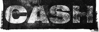
Looks like…Helvetica 93 Black Extended. I think the erosion is aftermarket.
Fuente identificada: Helvetica 93 Black Extended
K-Type
http://www.k-type.com/?cat=6
http://www.k-type.com/?cat=6
daaams ha dicho 
Maniackers
http://www2.wind.ne.jp/maniackers/designfont.html
(pilaster, i edited your first post to make the list bigger)
http://www2.wind.ne.jp/maniackers/designfont.html
(pilaster, i edited your first post to make the list bigger)
Good stuff. Consolidating the list will make it more manageable.

Fuente identificada: Birch

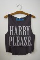
Looks like arial to me. ‘till should probably read ‘til, since its an abbreviation of 'until' which only has one 'l'.
Editado 3 veces. Śltima edición el 16/11/2012 a las 18:35 por pilaster
Fuente identificada: Arial
Editado 3 veces. Śltima edición el 16/11/2012 a las 18:35 por pilaster

Fuente identificada: Freestyle Script
Unresolved, but consensus is, this is custom.
http://www.dafont.com/forum/read/54792/what-font-was-used-for-the-nba-practice-jerseys-by-adidas
http://www.dafont.com/forum/read/54792/what-font-was-used-for-the-nba-practice-jerseys-by-adidas


Tomįs Silcher ha dicho
This is itself a Logo. I don't know if you just need to recreate the CE logo itself or I you would like a font based on it will all the other characters for a different purpose...
The Capital letters of Bauhaus are close, if it's not the mark you need.
http://myfonts.us/td-wqYjva
Huso horario CEST. Ahora son las 18:55
