
Fórum
13.590 posts Fontes identificadas Apenas pedidos
Posts por Heron2001


Fonte sugerida: City Bold Italic
Hondo5834 disse 
First I thought, it's ECLAT, but the "r" is different.
The original Eclat that was out way before there was a Creampuff did have the alternate "r" -- I even wrote to ITC to let them know they had someone out there ripping off their font. They replied they only had the one font to distribute, and therefore could do nothing about Creampuff. (Those are not the exact words, but close. I no longer have the correspondence.)
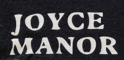
the As, Ps, and Os do not match up. This isn't a font. Sorry.

Those are close Don. But have you checked out Dan X. Solo's Celebration -- especially the "e"? I'm looking for a copy - the one on myfont is by RMU - and the e is not correct.
Fonte sugerida: Celebration

Fonte identificada: Kaushan Script

The 23 looks like some type of Garamond - that was stroked to make look heavier. Closest I've seen is the SoftMaker rip off.
Fonte sugerida: Garamond


Fonte identificada: Hogfish


Fonte identificada: Black Ops One
Fonte identificada: Sackers Gothic

I could find an exact. But if you are just looking for something close, maybe this can help.
NOT THE FONT
NOT THE FONT
Fonte sugerida: Love Surely

Fonte identificada: Wakaharo
You just made my day, thank you.
Fonte identificada: Vonique 92
Todos os horários são CEST. Agora são 19:33
