
Forum
13.584 posts Caratteri Identificati Solo richieste
Posts di Heron2001


Carattere Identificato: Kaushan Script

The 23 looks like some type of Garamond - that was stroked to make look heavier. Closest I've seen is the SoftMaker rip off.
Carattere suggerito: Garamond
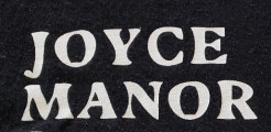
It looks like someone took Plantain and decided to mess it up manually.
Carattere suggerito: Plantain


Carattere Identificato: Hogfish


Carattere Identificato: Black Ops One
Carattere Identificato: Sackers Gothic

I could find an exact. But if you are just looking for something close, maybe this can help.
NOT THE FONT
NOT THE FONT
Carattere suggerito: Love Surely

Carattere Identificato: Wakaharo
You just made my day, thank you.
Carattere Identificato: Vonique 92

Carattere Identificato: Rosemary

Letters appear to have been taken from Brush Up and Brush Up Too - using a mix of Upper and Lower Case
Carattere Identificato: Brush Up


Fuso orario: CEST. Ora sono le 00:07
